Institutional Orderflow Pro — VWAP, Delta, and Liquidity
Institutional Orderflow Pro is a next-generation order flow analysis indicator designed to help traders identify institutional participation, directional bias, and exhaustion zones in real time.
Unlike traditional volume-based indicators, it merges VWAP dynamics, cumulative delta, relative volume, and liquidity proximity into a single unified dashboard that updates tick-by-tick — without repainting.
The indicator is open-source, transparent, and educational. It aims to provide traders with a clearer read on who controls the market — buyers or sellers — and where liquidity lies.
The indicator combines multiple institutional-grade analytics into one framework:
RVOL (Relative Volume) = Compares current volume against the average of recent bars to identify strong institutional participation.
zΔ (Delta Z-Score) = Normalizes the buying/selling delta to reveal unusually aggressive market behavior.
CVDΔ (Cumulative Volume Delta Change) = Shows which side (buyers/sellers) is dominating this bar’s order flow.
VWAP Direction & Slope = Determines whether price is trading above/below VWAP and whether VWAP is trending or flat.
PD Distance (Prev Day Confluence) = Measures the current price’s distance from previous day’s high, low, close, and VWAP in ATR units — highlighting liquidity zones.
ABS/EXH Detection = Identifies institutional absorption and exhaustion patterns where momentum may reverse.
Bias Computation = Combines VWAP direction + slope to give a simplified regime signal: UP, DOWN, or FLAT.
All metrics are displayed through a color-coded, non-repainting HUD:
🟢 = bullish / favorable conditions
🔴 = bearish / weak conditions
⚫ = neutral / flat
🟡 = absorption (potential trap zone)
🟠 = exhaustion (momentum fading)
| Metric | Signal | Meaning |
| ---------------------- | ------- | ---------------------------------------------- |
| **RVOL ≥ 1.3** | 🟢 | High institutional activity — valid setup zone |
| **zΔ ≥ 1.2 / ≤ -1.2** | 🟢 / 🔴 | Unusual buy/sell aggression |
| **CVDΔ > 0** | 🟢 | Buyers dominate this bar |
| **VWAP dir ↑ / ↓** | 🟢 / 🔴 | Institutional bias long/short |
| **Slope ok = YES** | 🟢 | Trending market |
| **PD dist ≤ 0.35 ATR** | 🟢 | Near key liquidity zones |
| **Bias = UP/DOWN** | 🟢 / 🔴 | Trend-aligned environment |
| **ABS/EXH active** | 🟡 / 🟠 | Caution — possible reversal zone |
How to Use
Confirm Volume Context → RVOL > 1.2
Align with Bias → Take longs only when Bias = UP, shorts only when Bias = DOWN.
Check Slope and VWAP Dir → Ensure trending context (Slope = YES).
Confirm CVD and zΔ → Flow should agree with price direction.
Avoid ABS/EXH Triggers → These signal exhaustion or absorption by large players.
Enter Near PD Zones → Ideal trade zones are within 0.35 ATR of prior-day levels.
This multi-factor confirmation reduces noise and focuses only on high-probability institutional setups.
Originality
This script was written from scratch in Pine v6.
It does not reuse existing public indicators except for standard built-ins (ta.vwap, ta.atr, etc.).
The unique combination of delta z-scoring, VWAP slope filtering, and real-time confluence zones distinguishes it from typical orderflow tools or cumulative delta overlays.
The core innovation is its merged real-time HUD that integrates institutional metrics and natural-language feedback directly on the chart, allowing traders to read market context intuitively rather than decode multiple subplots.
Notes & Disclaimers
This indicator does not repaint.
It’s intended for educational and analytical purposes only — not as financial advice or a guaranteed signal system.
Works best on liquid instruments (Futures, Indices, FX majors).
Avoid non-standard chart types (Heikin Ashi, Renko, etc.) for accurate readings.
Open-source, modifiable, and compatible with Pine v6.
Recommended Use
Apply it with clean charts and standard candles for the best clarity.
Use alongside a basic structure or volume profile to contextualize institutional bias zones.
Author: Dhawal Ranka
Category - Orderflow / VWAP / Institutional Analysis
Version: Pine Script™ v6
License: Open Source (Educational Use)
Search in scripts for "Up down"

Triple SuperTrend + RSI + Fib BBTriple SuperTrend + RSI + Fibonacci Bollinger Bands Strategy
📊 Overview
This advanced trading strategy combines the power of three SuperTrend indicators with RSI confirmation and Fibonacci Bollinger Bands to generate high-probability trade signals. The strategy is designed to capture strong trending moves while filtering out false signals through multi-indicator confluence.
🔧 Core Components
Three SuperTrend Indicators
The strategy uses three SuperTrend indicators with progressively longer periods and multipliers:
SuperTrend 1: 10-period ATR, 1.0 multiplier (fastest, most sensitive)
SuperTrend 2: 11-period ATR, 2.0 multiplier (medium sensitivity)
SuperTrend 3: 12-period ATR, 3.0 multiplier (slowest, most stable)
This layered approach ensures that all three timeframe perspectives align before generating a signal, significantly reducing false entries.
RSI Confirmation (7-period)
The Relative Strength Index acts as a momentum filter:
Long signals require RSI > 50 (bullish momentum)
Short signals require RSI < 50 (bearish momentum)
This prevents entries during weak or divergent price action.
Fibonacci Bollinger Bands (200, 2.618)
Uses a 200-period Simple Moving Average with 2.618 standard deviation bands (Fibonacci ratio). These bands serve dual purposes:
Visual representation of price extremes
Automatic exit trigger when price reaches overextended levels
📈 Entry Logic
LONG Entry (BUY Signal)
A LONG position is opened when ALL of the following conditions are met simultaneously:
All three SuperTrend indicators turn green (bullish)
RSI(7) is above 50
This is the first bar where all conditions align (no repainting)
SHORT Entry (SELL Signal)
A SHORT position is opened when ALL of the following conditions are met simultaneously:
All three SuperTrend indicators turn red (bearish)
RSI(7) is below 50
This is the first bar where all conditions align (no repainting)
🚪 Exit Logic
Positions are automatically closed when ANY of these conditions occur:
SuperTrend Color Change: Any one of the three SuperTrend indicators changes direction
Fibonacci BB Touch: Price reaches or exceeds the upper or lower Fibonacci Bollinger Band (2.618 standard deviations)
This dual-exit approach protects profits by:
Exiting quickly when trend momentum shifts (SuperTrend change)
Taking profits at statistical price extremes (Fib BB touch)
🎨 Visual Features
Signal Arrows
Green Up Arrow (BUY): Appears below the bar when long entry conditions are met
Red Down Arrow (SELL): Appears above the bar when short entry conditions are met
Yellow Down Arrow (EXIT): Appears above the bar when exit conditions are met
Background Coloring
Light Green Tint: All three SuperTrends are bullish (uptrend environment)
Light Red Tint: All three SuperTrends are bearish (downtrend environment)
SuperTrend Lines
Three colored lines plotted with varying opacity:
Solid line (ST1): Most responsive to price changes
Semi-transparent (ST2): Medium-term trend
Most transparent (ST3): Long-term trend structure
Dashboard
Real-time information panel showing:
Individual SuperTrend status (UP/DOWN)
Current RSI value and color-coded status
Current position (LONG/SHORT/FLAT)
Net Profit/Loss
⚙️ Customizable Parameters
SuperTrend Settings
ATR periods for each SuperTrend (default: 10, 11, 12)
Multipliers for each SuperTrend (default: 1.0, 2.0, 3.0)
RSI Settings
RSI length (default: 7)
RSI source (default: close)
Fibonacci Bollinger Bands
BB length (default: 200)
BB multiplier (default: 2.618)
Strategy Options
Enable/disable long trades
Enable/disable short trades
Initial capital
Position sizing
Commission settings
💡 Strategy Philosophy
This strategy is built on the principle of confluence trading - waiting for multiple independent indicators to align before taking a position. By requiring three SuperTrend indicators AND RSI confirmation, the strategy filters out the majority of low-probability setups.
The multi-timeframe SuperTrend approach ensures that short-term, medium-term, and longer-term trends are all in agreement, which typically occurs during strong, sustainable price moves.
The exit strategy is equally important, using both trend-following logic (SuperTrend changes) and mean-reversion logic (Fibonacci BB touches) to adapt to different market conditions.
📊 Best Use Cases
Trending Markets: Works best in markets with clear directional bias
Higher Timeframes: Designed for 15-minute to daily charts
Volatile Assets: SuperTrend indicators excel in assets with clear trends
Swing Trading: Hold times typically range from hours to days
⚠️ Important Notes
No Repainting: All signals are confirmed and will not change on historical bars
One Signal Per Setup: The strategy prevents duplicate signals on consecutive bars
Exit Protection: Always exits before potentially taking an opposite position
Visual Clarity: All three SuperTrend lines are visible simultaneously for transparency
🎯 Recommended Settings
While default parameters are optimized for general use, consider:
Crypto/Volatile Markets: May benefit from slightly higher multipliers
Forex: Default settings work well for major pairs
Stocks: Consider longer BB periods (250-300) for daily charts
Lower Timeframes: Reduce all periods proportionally for scalping
📝 Alerts
Built-in alert conditions for:
BUY signal triggered
SELL signal triggered
EXIT signal triggered
Set up notifications to never miss a trade opportunity!
Disclaimer: This strategy is for educational and informational purposes only. Past performance does not guarantee future results. Always backtest thoroughly and practice proper risk management before live trading.
Bubble Chart LiteBubble Chart Lite - Visual Market Intelligence
⸻
⚡ Quick Start - Here is how you get started in 30 seconds
Default view (Y-axis: None) = market heatmap
X-axis always = performance
Bubble size = importance (your choice of metric)
Hover any bubble for details
Switch timeframes to change the measurement window
Pick any stock ticker to see their friends
Pick one of the 143 etfs listed below and see their top constituents
That's it. Everything else is deeper cuts of data
⸻
Overview
The Bubble Chart is a market-wide visual map designed to instantly reveal how thousands of stocks and ETFs are performing relative to their peers, all in a single glance.
It dynamically builds relationships between ~3,400 stocks and 143 ETFs , each with its own “friends list” of most-connected tickers. It’s a bit unlike all the other indicators, which you’ll see shortly. It’s a very Tops Down, then Sideways view of the market.
The 144 ETFs covered in the Bubble Chart indicator are listed here in this watchlist: www.tradingview.com
Each bubble represents a security.
X-axis → performance (% change)
Y-axis → variable (you choose the insight)
Bubble size → market cap, relative weight, or %volume
Color → relative performance (green up, red down)
Border → sector color
Your current chart’s timeframe determines the measurement window:
Intraday chart → today so far
Daily chart → week-to-date (WTD)
Weekly chart → month-to-date (MTD)
Monthly chart → year-to-date (YTD)
Everything is relative to that timeframe’s performance window — making it as useful for morning scans as for long-term sector rotations. I recommend starting with an intraday chart. The bubbles represent the day so far on this timeframe.
⸻
📦 Version Differences
Bubble Chart Lite (Free):
✓ All features and dimensions
✓ Up to 5 bubbles displayed
✓ Perfect for tracking top movers
Bubble Chart (Invite-Only):
✓ All features and dimensions
✓ Up to 38 bubbles displayed
✓ See actual market breadth and structure
✓ Indicator name: “Bubble Chart”
✓ Available under the indicator “Bubble Chart” (Invite-Only) — details on my profile
⸻
📊 Y-Axis Options
1. “None” - Heatmap Mode
By default, the Y-axis is set to “None”.
In this mode, the chart functions as a market heatmap, with:
Left-to-right representing relative performance (% change)
Bubble color indicating gain/loss
Bubble size reflecting your chosen metric (Market Cap, Weight, or %Volume)
Up-down randomized just for bubble separation
Think of it as a fancy heatmap with extra context — sector coloring, bubble sizing, and tooltips that surface live data.
Perfect for a quick snapshot of the day’s winners and losers across your selected universe.
⸻
1. %Turnover
This measures conviction behind each move.
Turnover = current money flow vs. average money flow over your lookback window.
A large % move with low turnover = a weak move with little backing.
A moderate % move with high turnover = strong participation, higher conviction.
This is my personal favorite morning setup — it instantly reveals where real buying and selling pressure is emerging as the session unfolds.
A horizontal line across your selected ticker acts as a benchmark, so you can compare others’ conviction levels relative to it.
Any %turnover score >100 means more money than average is flowing in and out of this name. In the example above based on the top 5 holdings of GDX, there was one standout performer, and that’s WPM. this should put WPM on a watchlist if you’re interested in gold. It shows, that at least for one day, the market was putting money behind it.And more so than the other top 5 miners.
⸻
2. %ATR
Measures range expansion or compression relative to average volatility.
A stock can move big in price but stay inside a tight range → no expansion.
A stock can move little but break its typical volatility boundary → range expansion.
Expansion often signals momentum continuation; compression after large moves can precede turnarounds or consolidations.
This view helps you spot early volatility inflection points.
In the example above, in the food and beverage space, based on the top 5 holdings of the ETF PBJ, KR and DASH had moves that will expand their ATR. This means volatility is increasing for this ticker, in the direction of the color of the circle. So KR is expanding to the upside, while DASH is expanding to the downside. It should make a person cautious to go long DASH, as that’s not what the market is showing.The other moves by the other bobbles, show up as volatility contraction. Their price (CTVA, PBJ, KDP, and SYY) is stabilizing. (over the lookback period in settings).
⸻
3. ROC(5) Z-Score
Z-Score quantifies how far a data point deviates from its mean, measured in standard deviations.
Here it’s applied to 5-period Rate of Change (ROC5).
A high positive Z-Score = performance far above its historical average.
A low (negative) Z-Score = deeply oversold vs. history.
Use this view to identify stretched momentum or mean-reversion candidates:
Stocks high on the Y-axis and green = extended upside momentum
Stocks high but red = potential reversal zones
Stocks low and red = extreme washouts that may soon rebound
This makes it a powerful stock-picking lens for traders who look for reversions or contrarian entries.
The following is the XLU and its 5 top holdings. Looked at on the daily timeframe, which means the ROC(5) score is for its weekly ROC (see timeframe discussion above).
What you can see here is NEE is at a z-score of 205 (it’s 2.05 but we multiply by 100 for spacing). This means its weekly ROC(5) only happens 4-5 percent of the time. This is a perfect candidate to fade the move.
As you can see in the graph below, that charts NEE, every time its ROC(5) z-score (the bottom pane) has reached this level on the weekly, the move ends (at least for a short period of time. The rubber band of momentum is too far extended. You can use this for long setups too
⸻
4. RSI(15) Z-Score
Similar to the ROC version, but based on RSI(15).
It contextualizes RSI against its own historical distribution, not the fixed 0–100 scale.
When RSI’s Z-Score is above +100 → historically overbought.
Below -100 → historically oversold.
A stock with a high RSI Z-Score but negative performance may be starting to roll over.
A stock with a low RSI Z-Score but positive performance could be beginning a rebound.
This lens is especially powerful for early spotting of turning points in swing and position trades.
Above is an example of how to read it with the top 5 stocks in the IFRA ETF.
⸻
5. %52-Week High / %52-Week Low
These two let you visualize positioning within the broader yearly range.
%52-Week High:
Shows how close each ticker is to its highs. Stocks near the top may be in breakout mode.
%52-Week Low:
Shows distance from the lows. Watching these can highlight potential recovery trades — many reversals start when beaten-down stocks begin to cluster and climb from their lows.
Are you really going to want to mess around with VZ? Other companies are winning the race
⸻
⚙️ Bubble Size Options
Market Cap-
Larger companies = larger bubbles.
Ideal for weighting visibility by overall size of influence in the market or sector.
ETF/Friend Weight-
Scales bubbles by their relationship weight to the target ETF or stock.
This helps identify which peers or constituents exert the most pull within the current context.
%Volume-
This scales by relative volume to average volume.
Big bubbles here mean unusual activity, perfect for spotting where participation is surging.
⸻
👥 Friends — Relationship Mapping
Every ticker on the chart has its own “friends list.”
These aren’t arbitrary. They’re discovered through a multi-stage algorithm that analyzes co-occurrence of holdings across ETFs and sectors, roughly like social network analysis for stocks. This is what allows a chart of one stock to intelligently surface others that behave like it, whether through shared ETFs, sector overlap, or statistical co-presence.
Why Friends Matter: When you load AAPL, the chart doesn't just show random stocks. It shows AAPL's "friends", the tickers most connected to it through:
Shared ETF holdings
Sector relationships
Statistical co-movement
This means you're seeing AAPL's context, not just AAPL. Example: AAPL up 2% might look strong, but if all its friends are up 3-4%, AAPL is actually lagging. The chart reveals this instantly.
⸻
Common Setups - do these today
Morning Momentum Scan: - Y-axis: %Turnover - Bubble Size: %Volume - Look for: Top-right quadrant (high performance + high conviction)
Reversal Hunting: - Y-axis: RSI(15) Z-Score - Look for: Red bubbles above +100 (overbought rolling over) Green bubbles below -100 (oversold bouncing)
Sector Rotation: - Y-axis: None (heatmap mode) - Bubble Size: Market Cap - Look for: Color clustering by sector (border colors)
⸻
🧩 Data Sources
ETF Constituents:
ETF holdings are derived from information filed with the SEC’s EDGAR database, specifically N-PORT-P filings. These filings are public records submitted by ETF issuers.
Because EDGAR data can vary in structure and naming conventions, additional parsing, fuzzy matching, and ticker reconciliation logic were applied. Some inconsistencies may remain, and minor inaccuracies are possible.
EDGAR filings can also lag slightly behind real-time changes to ETF portfolios; however, for this visualization tool, that level of latency does not materially affect its purpose or insights.
Exchange & Share Count Data:
Information on exchanges and outstanding shares primarily comes from the SEC Company Facts API.
When unavailable, supplemental values are inferred from public SEC filings such as 8-K, 10-Q, and 10-K reports, and the SEC Company Submissions API for general company metadata.
All such data is publicly accessible through the SEC’s online systems.
I will update the SEC information on the ETFs once every 3 months to ensure etf constituent accuracy.
Sector & Industry Classification:
Sector and industry classifications were developed through a custom workflow that combines automated and human-reviewed methods.
An internal AI system analyzed each company’s publicly available website information to summarize business activities and assign one of 144 custom-defined industry categories.
Results were cross-checked by multiple independent classification models, and any uncertain outputs were manually reviewed for accuracy.
To improve interpretive consistency, publicly available information from StockAnalysis.com was also referenced (not republished) to inform final classifications.
Their content was used in accordance with their stated policy allowing limited reference with attribution — no full content or proprietary data was reproduced.
⸻
🚀 How to Use It
Load the Bubble Chart on any stock, ETF, or futures symbol.
Choose your Y-axis insight — start with “None” for the heatmap.
Adjust bubble size to highlight capital weight or activity.
Switch timeframes to shift context (today, this week, month, or year).
Hover bubbles for details: sector, turnover, z-scores, %volume, and more.
⸻
❓ Frequently Asked Questions
Q: Why do I only see 5 bubbles?
A: You're using Bubble Chart Lite. The full version shows up to 39 bubbles simultaneously for complete market breadth..
To get access:
Find the "Bubble Chart" (invite-only) indicator on TradingView
Read the description for access instructions
Or visit my TradingView profile for details
Q: Can I customize which tickers appear?
A: The indicator automatically selects the most relevant tickers based on the current chart's symbol and the friends algorithm. This ensures you're seeing context, not random stocks.
Q: What timeframe should I use?
A: Any timeframe works. The chart adapts: - Intraday = today's performance - Daily = week-to-date - Weekly = month-to-date - Monthly = year-to-date
Q: How often does the friends list update?
A: Friends relationships are recalculated periodically as ETF holdings change (once every 3 months). The relationships are stable enough that daily changes are minimal.
Q: Does this work on crypto/forex?
A: Currently optimized for US equities and ETFs. Other asset classes may show limited friends data.
Q: The chart looks cluttered. Help?
A: Start with Y-axis: None and Bubble Size: Market Cap. You can also choose to pick less number of bubbles which will clear up the chart
⸻
The Bubble Chart is a market topology engine that visualizes participation, conviction, volatility, and sentiment in real time.
Whether you’re scanning morning momentum, identifying exhausted moves, or exploring ETF ecosystems, it gives you a spatial view of where the action really is.

Bubble ChartBubble Chart- Visual Market Intelligence
⸻
⚡ Quick Start - Here is how you get started in 30 seconds
Default view (Y-axis: None) = market heatmap
X-axis always = performance
Bubble size = importance (your choice of metric)
Hover any bubble for details
Switch timeframes to change the measurement window
Pick any stock ticker to see their friends
Pick one of the 143 etfs listed below and see their top constituents
That's it. Everything else is deeper cuts of data
⸻
Overview
The Bubble Chart is a market-wide visual map designed to instantly reveal how thousands of stocks and ETFs are performing relative to their peers, all in a single glance.
It dynamically builds relationships between ~3,400 stocks and 143 ETFs , each with its own “friends list” of most-connected tickers. It’s a bit unlike all the other indicators, which you’ll see shortly. It’s a very Tops Down, then Sideways view of the market.
The 144 ETFs covered in the Bubble Chart indicator are listed here in this watchlist: www.tradingview.com
Each bubble represents a security.
X-axis → performance (% change)
Y-axis → variable (you choose the insight)
Bubble size → market cap, relative weight, or %volume
Color → relative performance (green up, red down)
Border → sector color
Your current chart’s timeframe determines the measurement window:
Intraday chart → today so far
Daily chart → week-to-date (WTD)
Weekly chart → month-to-date (MTD)
Monthly chart → year-to-date (YTD)
Everything is relative to that timeframe’s performance window — making it as useful for morning scans as for long-term sector rotations. I recommend starting with an intraday chart. The bubbles represent the day so far on this timeframe.
⸻
📦 Version Differences
Bubble Chart Lite (Free):
✓ All features and dimensions
✓ Up to 5 bubbles displayed
✓ Perfect for tracking top movers
Bubble Chart (Invite-Only):
✓ All features and dimensions
✓ Up to 38 bubbles displayed
✓ See actual market breadth and structure
✓ Indicator name: “Bubble Chart”
✓ Available under the indicator “Bubble Chart” (Invite-Only) — details on my profile
⸻
📊 Y-Axis Options
1. “None” - Heatmap Mode
By default, the Y-axis is set to “None”.
In this mode, the chart functions as a market heatmap, with:
Left-to-right representing relative performance (% change)
Bubble color indicating gain/loss
Bubble size reflecting your chosen metric (Market Cap, Weight, or %Volume)
Up-down randomized just for bubble separation
Think of it as a fancy heatmap with extra context — sector coloring, bubble sizing, and tooltips that surface live data.
Perfect for a quick snapshot of the day’s winners and losers across your selected universe.
⸻
1. %Turnover
This measures conviction behind each move.
Turnover = current money flow vs. average money flow over your lookback window.
A large % move with low turnover = a weak move with little backing.
A moderate % move with high turnover = strong participation, higher conviction.
This is my personal favorite morning setup — it instantly reveals where real buying and selling pressure is emerging as the session unfolds.
A horizontal line across your selected ticker acts as a benchmark, so you can compare others’ conviction levels relative to it.
Any %turnover score >100 means more money than average is flowing in and out of this name. In the example above, ELS, AMT, SUI, and PSA were positive on the day and saw more than the average amount of money being transacted on these tickers today. Do the same for the negative (KIM, ESS, HST, etc), and you know where the money is going. Below 100, the move lacked conviction.
⸻
2. %ATR
Measures range expansion or compression relative to average volatility.
A stock can move big in price but stay inside a tight range → no expansion.
A stock can move little but break its typical volatility boundary → range expansion.
Expansion often signals momentum continuation; compression after large moves can precede turnarounds or consolidations.
This view helps you spot early volatility inflection points.
In the example above, in XLRE, you can see there are a lot of companies that are experiencing a range expansion to the downside. These stocks are now short setup stocks, as the power is pretty overwhelming (number of top companies as well as magnitude over the 100 index). However, there are 3 Stocks that are doing something completely different than the rest. AMT, SBAC, and CCI are experiencing range expansion (volatility) to the upside. These may become the new leaders. You would have to inspect each ticker to see what’s going on.
⸻
3. ROC(5) Z-Score
Z-Score quantifies how far a data point deviates from its mean, measured in standard deviations.
Here it’s applied to 5-period Rate of Change (ROC5).
A high positive Z-Score = performance far above its historical average.
A low (negative) Z-Score = deeply oversold vs. history.
Use this view to identify stretched momentum or mean-reversion candidates:
Stocks high on the Y-axis and green = extended upside momentum
Stocks high but red = potential reversal zones
Stocks low and red = extreme washouts that may soon rebound
This makes it a powerful stock-picking lens for traders who look for reversions or contrarian entries.
The following is the XLU and its 5 top holdings. Looked at on the daily timeframe, which means the ROC(5) score is for its weekly ROC (see timeframe discussion above).
What you can see here is most stocks are within their normal acceleration band. However BIIB is very close to -200. This is uncommon.As you can see from the chart of BIIB with it’s ROC(5) graphed below it, this does indicate a short term turn, and is a high probability long setup.
⸻
4. RSI(15) Z-Score
Similar to the ROC version, but based on RSI(15).
It contextualizes RSI against its own historical distribution, not the fixed 0–100 scale.
When RSI’s Z-Score is above +100 → historically overbought.
Below -100 → historically oversold.
A stock with a high RSI Z-Score but negative performance may be starting to roll over.
A stock with a low RSI Z-Score but positive performance could be beginning a rebound.
This lens is especially powerful for early spotting of turning points in swing and position trades.
In this view, we can see a bunch of stocks that are at or below their -200 Z-Score which suggests RSI is going to increase soon. Taking a look at KKR, we see that it is indeed an area where we might want to look for a short term bounce. .
⸻
5. %52-Week High / %52-Week Low
These two let you visualize positioning within the broader yearly range.
%52-Week High:
Shows how close each ticker is to its highs. Stocks near the top may be in breakout mode.
%52-Week Low:
Shows distance from the lows. Watching these can highlight potential recovery trades — many reversals start when beaten-down stocks begin to cluster and climb from their lows.
Are you really going to want to mess around with VZ? Other companies are winning the race
⸻
⚙️ Bubble Size Options
Market Cap-
Larger companies = larger bubbles.
Ideal for weighting visibility by overall size of influence in the market or sector.
ETF/Friend Weight-
Scales bubbles by their relationship weight to the target ETF or stock.
This helps identify which peers or constituents exert the most pull within the current context.
%Volume-
This scales by relative volume to average volume.
Big bubbles here mean unusual activity, perfect for spotting where participation is surging.
⸻
👥 Friends — Relationship Mapping
Every ticker on the chart has its own “friends list.”
These aren’t arbitrary. They’re discovered through a multi-stage algorithm that analyzes co-occurrence of holdings across ETFs and sectors, roughly like social network analysis for stocks. This is what allows a chart of one stock to intelligently surface others that behave like it, whether through shared ETFs, sector overlap, or statistical co-presence.
Why Friends Matter: When you load AAPL, the chart doesn't just show random stocks. It shows AAPL's "friends", the tickers most connected to it through:
Shared ETF holdings
Sector relationships
Statistical co-movement
This means you're seeing AAPL's context, not just AAPL. Example: AAPL up 2% might look strong, but if all its friends are up 3-4%, AAPL is actually lagging. The chart reveals this instantly.
In this friendship look, you can see companies that are in better (and worse) shape for the month (we are looking at it on the “W” timeframe). If I didn’t own ORCL, INTC, or MU (hidden use tooltip), I should start looking at them.
⸻
Common Setups - do these today
Morning Momentum Scan: - Y-axis: %Turnover - Bubble Size: %Volume - Look for: Top-right quadrant (high performance + high conviction)
Reversal Hunting: - Y-axis: RSI(15) Z-Score - Look for: Red bubbles above +100 (overbought rolling over) Green bubbles below -100 (oversold bouncing)
Sector Rotation: - Y-axis: None (heatmap mode) - Bubble Size: Market Cap - Look for: Color clustering by sector (border colors)
⸻
🧩 Data Sources
ETF Constituents:
ETF holdings are derived from information filed with the SEC’s EDGAR database, specifically N-PORT-P filings. These filings are public records submitted by ETF issuers.
Because EDGAR data can vary in structure and naming conventions, additional parsing, fuzzy matching, and ticker reconciliation logic were applied. Some inconsistencies may remain, and minor inaccuracies are possible.
EDGAR filings can also lag slightly behind real-time changes to ETF portfolios; however, for this visualization tool, that level of latency does not materially affect its purpose or insights.
Exchange & Share Count Data:
Information on exchanges and outstanding shares primarily comes from the SEC Company Facts API.
When unavailable, supplemental values are inferred from public SEC filings such as 8-K, 10-Q, and 10-K reports, and the SEC Company Submissions API for general company metadata.
All such data is publicly accessible through the SEC’s online systems.
I will update the SEC information on the ETFs once every 3 months to ensure etf constituent accuracy.
Sector & Industry Classification:
Sector and industry classifications were developed through a custom workflow that combines automated and human-reviewed methods.
An internal AI system analyzed each company’s publicly available website information to summarize business activities and assign one of 144 custom-defined industry categories.
Results were cross-checked by multiple independent classification models, and any uncertain outputs were manually reviewed for accuracy.
To improve interpretive consistency, publicly available information from StockAnalysis.com was also referenced (not republished) to inform final classifications.
Their content was used in accordance with their stated policy allowing limited reference with attribution — no full content or proprietary data was reproduced.
⸻
🚀 How to Use It
Load the Bubble Chart on any stock, ETF, or futures symbol.
Choose your Y-axis insight — start with “None” for the heatmap.
Adjust bubble size to highlight capital weight or activity.
Switch timeframes to shift context (today, this week, month, or year).
Hover bubbles for details: sector, turnover, z-scores, %volume, and more.
⸻
❓ Frequently Asked Questions
Q: Why do I only see 5 bubbles?
A: You're using Bubble Chart Lite. The full version shows up to 39 bubbles simultaneously for complete market breadth..
To get access:
Find the "Bubble Chart" (invite-only) indicator on TradingView
Read the description for access instructions
Or visit my TradingView profile for details
Q: Can I customize which tickers appear?
A: The indicator automatically selects the most relevant tickers based on the current chart's symbol and the friends algorithm. This ensures you're seeing context, not random stocks.
Q: What timeframe should I use?
A: Any timeframe works. The chart adapts: - Intraday = today's performance - Daily = week-to-date - Weekly = month-to-date - Monthly = year-to-date
Q: How often does the friends list update?
A: Friends relationships are recalculated periodically as ETF holdings change (once every 3 months). The relationships are stable enough that daily changes are minimal.
Q: Does this work on crypto/forex?
A: Currently optimized for US equities and ETFs. Other asset classes may show limited friends data.
Q: The chart looks cluttered. Help?
A: Start with Y-axis: None and Bubble Size: Market Cap. You can also choose to pick less number of bubbles which will clear up the chart
⸻
The Bubble Chart is a market topology engine that visualizes participation, conviction, volatility, and sentiment in real time.
Whether you’re scanning morning momentum, identifying exhausted moves, or exploring ETF ecosystems, it gives you a spatial view of where the action really is.

CyberTradingV1.4 TRexCyberTradingV1.3 — Multi-TF Volatility/Structure + FVG Suite (by College Pips)
TL;DR
One utility to read volatility regime (ATR vs TH), map market structure & swings, and track FVG/CE imbalances—so you can gauge range, context and entries in one place. No signals or promises; it’s a contextual toolkit.
What it does
Volatility table (multi-TF): Shows ATR-style and TH proxies across 1m → Monthly, so you can compare current TF vs higher TFs.
Composite levels: LQC / GAM / Trigger / TRex quantify “how much is enough” for legs/impulses relative to the active TF.
Structure & swings: Validated swing highs/lows with optional time-anchored rectangles (height sized by LQC) and auto structure/diagonal lines.
Imbalances (FVG): Auto-detect UP/DOWN FVGs, extend forward, optional CE line; alerts fire on touches/entries/fills.
Candle sizing: Directional color map by fixed ATR-ratio buckets; Inside Bars are force-colored for clarity.
How components work together (mashup rationale)
Read regime with the table (ATR vs TH per TF).
Map structure with swings/lines to see HH/HL/LH/LL context.
Focus imbalances with FVG + optional CE; monitor with alerts.
Act with thresholds using LQC/GAM/Trigger/TRex to standardize expectations across symbols/TFs.
Method transparency
ATR/TH math: ATR is a smoothed multi-window blend; TH scales the daily range to TF via √time.
Composites: LQC ≈ √(ATR×TH) × C(TF); GAM2/3/4 and Trigger/TRex apply TF-specific scalars to min/max aggregates (see source for exact coefficients).
Multi-TF: Values come from request.security and finalize on higher-TF bar close (no look-ahead).
Swings: Confirmed using left/right strengths; labels are offset back to the pivot bar.
FVG/CE: Classic 3-bar definition; CE is the midpoint line. Boxes extend until touched/filled; optional auto-delete on fill.
Usage
Enable the table to gauge expansion/contraction.
Turn on swing rectangles for LQC-sized reaction zones.
Toggle FVG + CE on your execution TF; use alerts to catch re-entries/resolutions.
Combine with price action and your own trade plan.
Limitations & fair warnings (be honest)
Offsets/past plotting: Swing labels and rectangles are anchored to past bars (offset = -right_strength). They do not predict future bars.
Repainting notes: Swings confirm after right_strength bars; higher-TF values finalize on their close. Past markings can update as confirmations occur.
Tick handling: Uses syminfo.mintick (special cases for JPY/XAU/XAG). Validate on exotic symbols.
No promises: This is a context tool, not a buy/sell signal generator.
Alerts included
ABOVE/BELOW threshold: Price crossing CE or FVG bounds.
IOFED up/down: Price entering an FVG from above/below.
Inputs (high-level)
Layout/positioning, color palettes, swing rectangle styling (width/fill/border), detection strengths, label/line widths, FVG lookback, CE on/off & style, auto-delete filled boxes.
Credits & reuse
Concepts like FVG/CE are widely known in market-microstructure education.
This implementation—table architecture, LQC/GAM/Trigger framework, swing rectangles, candle bucketing, and alert logic—is original to College Pips / CyberTradingV1.4

Inversion Fair Value Gap Signals [AlgoAlpha]🟠 OVERVIEW
This script is a custom signal tool called Inversion Fair Value Gap Signals (IFVG) , designed to detect, track, and visualize fair value gaps (FVGs) and their inversions directly on price charts. It identifies bullish and bearish imbalances, monitors when these zones are mitigated or rejected, and extends them until resolution or expiration. What makes this script original is the inclusion of inversion logic—when a gap is filled, the area flips into an opposite "inversion fair value gap," creating potential reversal or continuation zones that give traders additional context beyond classic FVG analysis.
🟠 CONCEPTS
The script builds on the Smart Money Concepts (SMC) principle of fair value gaps, where inefficiencies form when price moves too quickly in one direction. Detection requires a three-bar sequence: a strong up or down move that leaves untraded price between bar highs and lows. To refine reliability, the script adds an ATR-based size filter and prevents overlap between zones. Once created, gaps are tracked in arrays until mitigation (price closing back into the gap), expiration, or transformation into an inversion zone. Inversions act as polarity flips, where bullish gaps become bearish resistance and bearish gaps become bullish support. Lower-timeframe volume data is also displayed inside zones to highlight whether buying or selling pressure dominated during gap creation.
🟠 FEATURES
Automatic detection of bullish and bearish FVGs with ATR-based thresholding.
Inversion logic: mitigated gaps flip into opposite-colored IFVG zones.
Volume text overlay inside each zone showing up vs down volume.
Visual markers (△/▽ for FVG, ▲/▼ for IFVG) when price exits a zone without mitigation.
🟠 USAGE
Apply the indicator to any chart and enable/disable bullish or bearish FVG detection depending on your focus. Use the colored gap zones as areas of interest: bullish gaps suggest possible continuation to the upside until mitigated, while bearish gaps suggest continuation down. When a gap flips into an inversion zone, treat it as potential support/resistance—bullish IFVGs below price may act as demand, while bearish IFVGs above price may act as supply. Watch the embedded up/down volume data to gauge the strength of participants during gap formation. Use the △/▽ and ▲/▼ markers to spot when price rejects gaps or inversions without filling them, which can indicate strong trending momentum. For practical use, combine alerts with your trade plan to track when new gaps form, when old ones are resolved, or when key zones flip into inversions, helping you align entries, targets, or reversals with institutional order flow logic.

MACD COM PONTOS//@version=5
indicator(title="MACD COM PONTOS", shorttitle="MACD COM PONTOS")
//Plot Inputs
res = input.timeframe("", "Indicator TimeFrame")
fast_length = input.int(title="Fast Length", defval=12)
slow_length = input.int(title="Slow Length", defval=26)
src = input.source(title="Source", defval=close)
signal_length = input.int(title="Signal Smoothing", minval = 1, maxval = 999, defval = 9)
sma_source = input.string(title="Oscillator MA Type", defval="EMA", options= )
sma_signal = input.string(title="Signal Line MA Type", defval="EMA", options= )
// Show Plots T/F
show_macd = input.bool(true, title="Show MACD Lines", group="Show Plots?", inline="SP10")
show_macd_LW = input.int(3, minval=0, maxval=5, title = "MACD Width", group="Show Plots?", inline="SP11")
show_signal_LW= input.int(2, minval=0, maxval=5, title = "Signal Width", group="Show Plots?", inline="SP11")
show_Hist = input.bool(true, title="Show Histogram", group="Show Plots?", inline="SP20")
show_hist_LW = input.int(5, minval=0, maxval=5, title = "-- Width", group="Show Plots?", inline="SP20")
show_trend = input.bool(true, title = "Show MACD Lines w/ Trend Color", group="Show Plots?", inline="SP30")
show_HB = input.bool(false, title="Show Highlight Price Bars", group="Show Plots?", inline="SP40")
show_cross = input.bool(false, title = "Show BackGround on Cross", group="Show Plots?", inline="SP50")
show_dots = input.bool(true, title = "Show Circle on Cross", group="Show Plots?", inline="SP60")
show_dots_LW = input.int(5, minval=0, maxval=5, title = "-- Width", group="Show Plots?", inline="SP60")
//show_trend = input(true, title = "Colors MACD Lines w/ Trend Color", group="Show Plots?", inline="SP5")
// MACD Lines colors
col_macd = input.color(#FF6D00, "MACD Line ", group="Color Settings", inline="CS1")
col_signal = input.color(#2962FF, "Signal Line ", group="Color Settings", inline="CS1")
col_trnd_Up = input.color(#4BAF4F, "Trend Up ", group="Color Settings", inline="CS2")
col_trnd_Dn = input.color(#B71D1C, "Trend Down ", group="Color Settings", inline="CS2")
// Histogram Colors
col_grow_above = input.color(#26A69A, "Above Grow", group="Histogram Colors", inline="Hist10")
col_fall_above = input.color(#B2DFDB, "Fall", group="Histogram Colors", inline="Hist10")
col_grow_below = input.color(#FF5252, "Below Grow", group="Histogram Colors",inline="Hist20")
col_fall_below = input.color(#FFCDD2, "Fall", group="Histogram Colors", inline="Hist20")
// Alerts T/F Inputs
alert_Long = input.bool(true, title = "MACD Cross Up", group = "Alerts", inline="Alert10")
alert_Short = input.bool(true, title = "MACD Cross Dn", group = "Alerts", inline="Alert10")
alert_Long_A = input.bool(false, title = "MACD Cross Up & > 0", group = "Alerts", inline="Alert20")
alert_Short_B = input.bool(false, title = "MACD Cross Dn & < 0", group = "Alerts", inline="Alert20")
// Calculating
fast_ma = request.security(syminfo.tickerid, res, sma_source == "SMA" ? ta.sma(src, fast_length) : ta.ema(src, fast_length))
slow_ma = request.security(syminfo.tickerid, res, sma_source == "SMA" ? ta.sma(src, slow_length) : ta.ema(src, slow_length))
macd = fast_ma - slow_ma
signal = request.security(syminfo.tickerid, res, sma_signal == "SMA" ? ta.sma(macd, signal_length) : ta.ema(macd, signal_length))
hist = macd - signal
// MACD Trend and Cross Up/Down conditions
trend_up = macd > signal
trend_dn = macd < signal
cross_UP = signal >= macd and signal < macd
cross_DN = signal <= macd and signal > macd
cross_UP_A = (signal >= macd and signal < macd) and macd > 0
cross_DN_B = (signal <= macd and signal > macd) and macd < 0
// Condition that changes Color of MACD Line if Show Trend is turned on..
trend_col = show_trend and trend_up ? col_trnd_Up : trend_up ? col_macd : show_trend and trend_dn ? col_trnd_Dn: trend_dn ? col_macd : na
//Var Statements for Histogram Color Change
var bool histA_IsUp = false
var bool histA_IsDown = false
var bool histB_IsDown = false
var bool histB_IsUp = false
histA_IsUp := hist == hist ? histA_IsUp : hist > hist and hist > 0
histA_IsDown := hist == hist ? histA_IsDown : hist < hist and hist > 0
histB_IsDown := hist == hist ? histB_IsDown : hist < hist and hist <= 0
histB_IsUp := hist == hist ? histB_IsUp : hist > hist and hist <= 0
hist_col = histA_IsUp ? col_grow_above : histA_IsDown ? col_fall_above : histB_IsDown ? col_grow_below : histB_IsUp ? col_fall_below :color.silver
// Plot Statements
//Background Color
bgcolor(show_cross and cross_UP ? col_trnd_Up : na, editable=false)
bgcolor(show_cross and cross_DN ? col_trnd_Dn : na, editable=false)
//Highlight Price Bars
barcolor(show_HB and trend_up ? col_trnd_Up : na, title="Trend Up", offset = 0, editable=false)
barcolor(show_HB and trend_dn ? col_trnd_Dn : na, title="Trend Dn", offset = 0, editable=false)
//Regular Plots
plot(show_Hist and hist ? hist : na, title="Histogram", style=plot.style_columns, color=color.new(hist_col ,0),linewidth=show_hist_LW)
plot(show_macd and signal ? signal : na, title="Signal", color=color.new(col_signal, 0), style=plot.style_line ,linewidth=show_signal_LW)
plot(show_macd and macd ? macd : na, title="MACD", color=color.new(trend_col, 0), style=plot.style_line ,linewidth=show_macd_LW)
hline(0, title="0 Line", color=color.new(color.gray, 0), linestyle=hline.style_dashed, linewidth=1, editable=false)
plot(show_dots and cross_UP ? macd : na, title="Dots", color=color.new(trend_col ,0), style=plot.style_circles, linewidth=show_dots_LW, editable=false)
plot(show_dots and cross_DN ? macd : na, title="Dots", color=color.new(trend_col ,0), style=plot.style_circles, linewidth=show_dots_LW, editable=false)
//Alerts
if alert_Long and cross_UP
alert("Symbol = (" + syminfo.tickerid + ") TimeFrame = (" + timeframe.period + ") Current Price (" + str.tostring(close) + ") MACD Crosses Up.", alert.freq_once_per_bar_close)
if alert_Short and cross_DN
alert("Symbol = (" + syminfo.tickerid + ") TimeFrame = (" + timeframe.period + ") Current Price (" + str.tostring(close) + ") MACD Crosses Down.", alert.freq_once_per_bar_close)
//Alerts - Stricter Condition - Only Alerts When MACD Crosses UP & MACD > 0 -- Crosses Down & MACD < 0
if alert_Long_A and cross_UP_A
alert("Symbol = (" + syminfo.tickerid + ") TimeFrame = (" + timeframe.period + ") Current Price (" + str.tostring(close) + ") MACD > 0 And Crosses Up.", alert.freq_once_per_bar_close)
if alert_Short_B and cross_DN_B
alert("Symbol = (" + syminfo.tickerid + ") TimeFrame = (" + timeframe.period + ") Current Price (" + str.tostring(close) + ") MACD < 0 And Crosses Down.", alert.freq_once_per_bar_close)
//End Code

Unusual Moves Detector# Unusual Moves Detector
A TradingView indicator that detects and alerts users to unusual price movements based on ATR (Average True Range) and volume analysis. This indicator is designed to identify price action that deviates significantly from normal market behavior.
## Features
### Core Detection Mechanisms
- **ATR-Based Volatility Detection**: Identifies price movements that exceed normal volatility levels
- **Volume Analysis**: Optional volume spike detection to confirm unusual moves
- **Signal Persistence Tracking**: Monitors how many signals occur within a lookback period
### Visual Indicators
- **Up/Down Arrows**: Green triangles for unusual upward moves, red triangles for downward moves
- **Signal Strength Labels**: Numbers showing how many signals occurred in the lookback period
- **Real-time Metrics Table**: Displays current ATR and volume ratios
### Customizable Parameters
1. **ATR Period** (default: 14)
- Length for Average True Range calculation
- Affects volatility measurement sensitivity
2. **Volume MA Period** (default: 20)
- Period for volume moving average
- Used in volume spike detection
3. **ATR Multiplier** (default: 2.0)
- How many times the ATR to trigger a signal
- Higher values = less sensitive to price moves
4. **Volume Multiplier** (default: 2.0)
- How many times the average volume to consider "high volume"
- Higher values = less sensitive to volume spikes
5. **Include Volume Analysis** (default: true)
- Toggle volume confirmation requirement
- When disabled, only price volatility matters
6. **Signal Lookback Period** (default: 5)
- How many bars to look back for signal counting
- Affects signal strength calculation
### Alert System
- **Upward Movement Alerts**: Triggers when unusual upward price action is detected
- **Downward Movement Alerts**: Triggers when unusual downward price action is detected
- **Customizable Alert Messages**: Can be configured in TradingView's alert system
### Information Display
Real-time metrics table shows:
- Current ATR value
- Volume ratio (current volume / average volume)
- Net signal count (up signals - down signals)
## Installation
1. Open TradingView's Pine Script Editor
2. Create a new indicator
3. Copy and paste the indicator code
4. Click "Add to Chart" to apply the indicator
## Usage Guide
### Basic Setup
1. Add the indicator to your chart
2. Adjust parameters based on your trading timeframe and style
3. Configure alerts if desired
### Parameter Tuning Tips
- **For More Signals**: Lower the ATR and Volume multipliers
- **For Fewer Signals**: Increase the multipliers
- **For Trend Following**: Increase the lookback period
- **For Quick Signals**: Decrease the lookback period
### Alert Setup
1. Click the indicator settings
2. Go to "Create Alert"
3. Choose either up or down move condition
4. Configure alert settings (sound, notification, etc.)
## Backtesting Compatibility
- Fully compatible with TradingView's backtesting engine
- All calculations use historical data only
- No forward-looking data or repainting
## Technical Details
- Written in Pine Script v6
- Optimized for real-time calculation
- Uses native TradingView functions for performance
- Compatible with all timeframes
## Performance Considerations
- Lightweight computation using built-in functions
- Efficient memory usage with variable optimization
- Real-time calculation with minimal lag
## Support and Contribution
Feel free to modify and improve the indicator according to your needs. The code is well-commented for easy understanding and modification.
## License
Free to use and modify for personal and commercial purposes.
## Disclaimer
This indicator is for informational purposes only. Always conduct your own analysis and consider multiple factors when making trading decisions.

Wavelet Kernal ATR [BackQuant]Wavelet Kernal ATR
Introduction
Wavelet Kernal ATR is a closed-source, chart-side tool that fuses an edge-preserving “wavelet kernal” smoother with an ATR-aware regime line. The goal is simple: follow the real move, ignore the static, and give you clean, visual places to manage risk. It can color the trend directly on price, flip states when regime changes, and (optionally) add a secondary moving-average overlay for confirmation all while keeping the chart readable.
What it is
A single adaptive baseline designed to act like a “bias rail.” When it’s up, you favor longs; when it’s down, you favor shorts. It updates in a way that’s responsive to fresh information but resistant to insignificant wiggles. Around that baseline, an ATR-scaled envelope governs how and when the line concedes to volatility, which helps avoid flip-flopping in chop. Because this release is closed source, the following focuses on behavior and practical use rather than internal math.
What it’s used for
Bias & context: Read the backdrop with one glance; green = bullish regime, red = bearish regime.
Timing: Use slope changes and pullbacks to the line for entries aligned with the dominant push.
Risk placement: The line and its volatility envelope give intuitive zones for stops and targets.
Clarity: Paint candles by state and keep other overlays to a minimum to reduce decision noise.
Why “Wavelet Kernal” matters (plain English)
A wavelet kernal is a localized, scale-aware weighting profile. Instead of averaging every bar equally—or with a single, fixed decay—it emphasizes the most informative part of the recent window while softly down-weighting points that are either too old or too extreme. Three practical benefits result:
Edge preservation: Turning points are less “smeared” than with conventional smoothers, so the line can pivot sooner on genuine breakouts without chasing every tick.
Multi-scale sensitivity: The kernal “listens” to structure at multiple scales inside a compact window, helping it track swing-sized movement while suppressing micro-chop.
Lag vs. noise balance: Because the weighting is localized and shape-aware, you get a calmer line at similar responsiveness compared to common filters; fewer false flips, more meaningful ones.
You don’t need to know the internals to use it: think of the wavelet kernal as a smart stethoscope for price. It hears the heartbeat (trend/impulse) and ignores the coughs (random spikes).
How it behaves
Trend mode: When price expands directionally, the line “sticks” to the move and stays colored in that direction. Pullbacks that remain shallow relative to volatility usually do not flip the state.
Transition mode: After a large push, the line may flatten as volatility compresses. Flat + frequent small flips is the platform telling you: edge is low, wait for expansion.
Shock handling: On sudden spikes, the ATR envelope acts like a reality check—minor overreactions are absorbed, while statistically meaningful breaks force the baseline to concede and re-anchor.
Reading the line (quick heuristics)
Green + rising: Bias long; look for pullbacks toward the line that stall and resume.
Red + falling: Bias short; look for rallies into the line that fade.
Flat + rapid color flips: Stand down or scale down—let the next expansion choose the side.
Color flip at a prior S/R: Treat as a higher-quality signal than flips in the middle of nowhere.
Baseline + ATR corridor (concept)
The volatility envelope isn’t drawn as two fat bands here; it’s used internally to keep the baseline honest. You can think of it as a “breathing room” rule: the line is allowed to adapt with trend, but it shouldn’t jump the fence unless price movement is large enough relative to recent volatility. That’s why the tool feels calm in chop and decisive during actual breaks.
Optional MA Overlay (confluence)
You can overlay a moving average of the baseline itself for slower-regime confirmation. When both agree (baseline direction and its MA slope), you have trend alignment. When they diverge, expect digestion or a possible transition. Keep this overlay subtle; it’s a context layer, not another signal firehose.
What it plots
Wavelet ATR line — the adaptive baseline that flips color with regime.
Optional MA of the baseline — slower confirmation, on or off.
Candle painting — bars can inherit long/short state for instant read-through.
Alerts — available for state flips up/down.
Inputs explained (effect on behavior)
Wavelet ATR Calculation
Price Source — Default hlc3 ; choose your preferred composite of OHLC.
Kernal Calculation Length — The horizon the kernal “listens to.” Longer = steadier, fewer flips; shorter = snappier, more flips.
Kernal Alpha — How strongly the kernal prioritizes the freshest data inside that horizon. Higher alpha = quicker to acknowledge new pushes; lower alpha = more patience.
ATR Period — Determines the volatility memory. Shorter = envelope reacts faster; longer = envelope demands more evidence to concede.
ATR Factor — Scales how “strict” the envelope is. Larger factor = more tolerance (fewer flips); smaller = more sensitivity (earlier regime shifts).
Confluence
Show Atr Moving Average — Turns on the secondary overlay.
MA Type — Choose the flavor you read best (simple, exponential, linear regression, etc.).
Moving Average Period — The overlay’s horizon; treat it as a background current.
Volume Factor / Sigma (when applicable) — Specialized parameter used by certain MA types to shape smoothness.
Plotting & UI
Plot Wavelet ATR — Toggle the main line.
Paint Candles According to Trend — Color bars by the baseline’s state.
Long/Short Colors — Match your chart theme.
A practical playbook
Trend-pullback continuation
Setup: Baseline is green and rising. Price pulls back toward it, stalls (small bodies or wicks into the line), then resumes upward.
Idea: Enter on the resumption. Protective stop often lives just below the line or the last swing low. Scale targets through prior highs or measured projections.
Breakout + acceptance
Setup: Baseline flattens after consolidation. Price expands away; baseline turns green/red and stays that way as two or three bars “accept” the new area.
Idea: Join on the first controlled retest toward the line. If the line instantly loses color again, treat it as a fakeout.
Failed test / flip-and-go
Setup: Price challenges the line from the wrong side but cannot close through it convincingly; shortly after, the baseline flips color back in the original direction.
Idea: Use that failed test as a springboard—risk tucked beyond the failed side.
Quality checks before you click
Structure context: Is the flip happening near prior highs/lows, session opens, or well-observed levels? Flips at structure carry more information.
Volatility posture: If range is compressing, be picky. If range is expanding, respect the first pullback after the flip.
Clutter discipline: Use the fewest layers that earn their place. Trend line + candle painting is often enough.
Common questions
“Why did the line not flip on that spike?” Because the move wasn’t large or sustained enough relative to recent volatility. The envelope forces patience.
“Why did it flip and then flip back?” That’s what digestion looks like. The kernal preserves edges, but when the market truly has no edge, brief flips are information: sit tight.
“Do I need the overlay MA?” No. It’s optional context. If it helps you filter marginal trades, keep it. If it adds noise, turn it off.
Troubleshooting & fine-tuning (principles, not prescriptions)
Too many flips? Increase the Kernal Calculation Length or the ATR Factor. You’re asking for a steadier bias.
Feels late on strong trends? Nudge Kernal Alpha higher or shorten the Kernal Length. You’re asking for earlier acknowledgment.
Stops feel random? Place initial risk just beyond the baseline (or the last swing beyond it), then trail only when fresh structure appears.
Charts feel crowded? Keep the baseline + candle coloring; hide the overlay and other ornaments.
Alerts
Wavelet ATR Trend Up
Wavelet ATR Trend Down
Final notes
This tool is built to minimize analysis fatigue: one adaptive line, strong visual feedback, and enough discipline from volatility logic to avoid the “every blip is a signal” trap. The internal math, weighting shapes, and state logic are proprietary and intentionally not disclosed here; you still have full control of behavior through the inputs above. As always, align the settings with your own trade plan, keep the chart readable, and let confluence—not clutter—do the heavy lifting.
Rapid bp-meter(2Y) MTF V2.0US 2Y Yield — Basis-Point Meter (30s Fast + 1m Confirm)
What it does (one-liner):
A simple, fast basis-point (bp) meter for the US 2-Year Treasury yield that shows a 30-second “pre-trigger” and a 1-minute confirmation so you can quickly gauge risk-on / risk-off during news and FOMC events.
Overview
This tool tracks the change in the US 2-Year yield in basis points (1 bp = 0.01%). It displays two readings:
Fast: 30-second bp change (early signal).
Confirm: 1-minute bp change (confirmation).
Color logic is intentionally simple:
Green = yields down beyond your threshold (typical risk-on bias).
Red = yields up beyond your threshold (typical risk-off bias).
Gray = within thresholds (no signal).
Typical interpretation (not a signal service):
Yields ↓ (green) often align with USD weakness / risk-on (e.g., EURUSD↑, XAUUSD↑, NQ100↑, USDJPY↓).
Yields ↑ (red) often align with USD strength / risk-off (e.g., EURUSD↓, XAUUSD↓, NQ100↓, USDJPY↑).
Works on any chart. The yield is fetched from your chosen symbol/timeframes via request.security, independent of the chart timeframe.
Inputs
Yield symbol: default TVC:US02Y.
(Alternative proxy if seconds TF not available: 2-yr futures CBOT:ZT1!—note futures price ↑ = yield ↓.)
Fast timeframe: default 30S. (Use 1m if your plan/symbol doesn’t support seconds.)
Confirm timeframe: default 1 (1-minute).
Fast trigger (bp): default 2.0 bp.
Confirm trigger (bp): default 5.0 bp.
No-repaint mode: uses completed bars only. Turn off if you want intrabar responsiveness (may repaint).
Panel position: choose where the table appears on your chart.
What the table shows
2Y Δ fast (30S): e.g., −2.4 bp (green)
2Y Δ conf (1): e.g., −6.1 bp (green)
Rule of thumb
Both GREEN → risk-on bias likely (consider EURUSD/XAU/NQ long, USDJPY short).
Both RED → risk-off bias likely (consider the inverse).
Mixed → wait for alignment or price structure confirmation.
How to use (step-by-step)
Add to any chart.
Set Yield symbol to TVC:US02Y. If seconds aren’t available, keep Fast=1m and Confirm=3m (or use ZT1! as a fast proxy + US02Y confirm).
Choose Fast/Confirm thresholds. Defaults (2 bp / 5 bp) are conservative for major news (CPI/NFP/FOMC).
During events, wait for the first 1–3 minutes to pass; then act only if both readings agree and price gives a clean impulse → pullback → continuation.
Risk: size down on news; use a fixed $ risk per trade; place stops beyond the impulse origin.
Optional: enable the built-in alerts (const messages) for Fast up/down and Confirm up/down.
Alerts (included)
Fast down (pre-trigger) – “US 2Y down ≥ fast threshold → risk-on (pre-trigger)”
Fast up (pre-trigger) – “US 2Y up ≥ fast threshold → risk-off (pre-trigger)”
Confirm down (confirmed) – “US 2Y down ≥ confirm threshold → risk-on (confirmed)”
Confirm up (confirmed) – “US 2Y up ≥ confirm threshold → risk-off (confirmed)”
Tip: You can customize alert text in TradingView’s alert dialog if you want to include thresholds or tickers.
Best practices & notes
Seconds data requires the appropriate plan and symbol support. If seconds aren’t supported for US02Y, use 1m/3m or combine ZT1! (futures) for “fast” with US02Y for confirm.
No-repaint mode is recommended; turning it off will read intrabar values that can change by bar close.
The meter is directional context, not an entry by itself—combine with levels (NY H/L, VWAP, H1 S/R).
On some sessions, headline vs. core news or Powell Q&A may cause second-leg reversals; confirm with price action.
Limitations (transparent)
This tool does not predict future yields; it only reads the recent bp change on your selected timeframes.
Correlations vary; yield moves don’t always translate into the same magnitude on FX/indices/commodities.
If your broker or symbol has delays or limited intraday history, readings may differ.
Futures proxy (ZT1!) is inversely related to yield; interpretation must be inverted if you use it for the fast leg.
What “inverse to yield” means
When yields fall, bond prices rise.
TVC:US02Y = the yield itself.
CBOT:ZT1! = the price of the 2-yr note futures.
So:
US02Y ↓ (−bp) ⇢ ZT1! ↑ (price up)
US02Y ↑ (+bp) ⇢ ZT1! ↓ (price down)
That’s the “inverse” part: yield and futures price move in opposite directions.
Disclaimer
This script is for informational and educational purposes only. It does not constitute financial, investment, or trading advice, and it does not guarantee outcomes or profits. Trading involves risk, including the loss of principal. Always do your own research and use proper risk management.

Transformer Flux DashboardHere’s a practical guide to what your Transformer Flux Dashboard does and how to use it.
What it is
A compact, two-column trading dashboard + signal pack that blends trend, MACD, and OBV into one view (“Flux Score”) and adds session awareness (pre-sessions and main sessions in Eastern time). It’s designed for regular candles by default and avoids repaint by letting you confirm on bar close.
Core pieces it calculates
Moving Averages
Two MAs: Fast (HMA/EMA) and Slow (HMA/EMA).
You choose length, line width, color, and transparency.
Trend engine (Strict/Lenient)
Uses the relation between Fast/Slow MA and a debounced fast-MA slope filter (slope > ATR×buffer).
Strict: requires fast>slow and slow rising (or the inverse for down).
Lenient: fast>slow or slow rising (or the inverse).
A confirmation window (bars) must hold true before trend flips. That window can be auto-tuned by session (Asia/London/NY) or set globally.
OBV confirmation (optional)
OBV smoothed by SMA; needs to be rising/falling for N bars (also session-aware if you enable presets).
MACD
Standard MACD Fast/Slow/Signal; the dashboard shows Bull ▲, Bear ▼ or Flat based on line vs signal.
Flux Score (top row)
A composite, smoothed gauge from 0–100:
40% Trend, 30% MACD, 30% OBV → EMA(3) smoothed.
Labels: Bullish ≥ 70, Bearish ≤ 30, otherwise Neutral.
Summary line explains why (e.g., “MACD↑, OBV↑, Trend up”).
Sessions & zones (Eastern/NY time)
Recognizes Asia / London / New York main sessions and pre-sessions using your chart’s Eastern time.
Session label (top of chart): text is white; background auto-matches the current session color (or your manual color).
Zone backgrounds (optional): off by default; when on, default transparency ≈ 95% (very light), with separate colors for each session and pre-session. A toggle lets you draw pre-session on top or beneath main sessions.
Signals & markers
Two strength tiers: Strong (Trend + OBV + MACD aligned) and Weak (2 of the 3 agree).
To reduce clutter, markers only appear on direction shifts (from last visible direction to a new one), and you can enforce a minimum bar gap.
Marker style:
Default Icons with LabelUp/LabelDown (tiny).
Colors: strong long = bright white by default; others configurable.
Weak markers are slightly offset from price using ATR so they don’t overlap wicks.
Dashboard (2-column)
Left column = label, right column = value:
Flux Score: numeric + Bullish/Neutral/Bearish tag.
Summary: short reason of the score.
Trend: UP / DOWN / FLAT (cell tinted green/red/gray).
MACD: Bull ▲ / Bear ▼ / Flat (tinted).
Signal: last printed signal + bar age (fresh signals get a lighter tint).
MA: slow MA type/length and up/down arrow.
Sess: current session label (e.g., “Pre-London”, “New York”).
VIX / VXN (optional): shows current value.
Auto tint: based on calm/watch/elevated thresholds (you control levels and colors).
Manual tint: fixed BG color if you prefer consistency.
Params: “P”=trend bars, “O”=OBV bars, mode (Strict/Lenient), and “Candles”.
You can set a global Default Transparency for the dashboard cells.
Key settings to know
Confirm On Close: when on (default), trend/OBV/MACD states use the last confirmed bar; this avoids mid-bar flicker and reduces repaint risk.
Session presets: when enabled, the number of bars required for confirmations tightens/loosens per session (e.g., Asia uses more bars than NY).
Colors & Opacity:
MA lines have their own transparency (default 0 = fully opaque).
Dashboard cells use a single global transparency (default 40%).
Session zones default to very light (95%) and are off by default.
VIX/VXN cells can auto-color by regime or use a manual background.
Markers:
“Icons” vs “Ticks.” Default is Icons with tiny labels up/down.
“Shift only” display reduces noise; you can also set min bar spacing.
How to read it (quick workflow)
Flux Score row: a fast “risk-on/off” gauge.
≥70 with green Trend/MACD cells → higher-conviction long context.
≤30 with red Trend/MACD cells → higher-conviction short context.
Summary explains why the score is what it is.
Signal row: tells you the last official signal and how many bars ago it fired. Fresh signals tint lighter.
MA row: aligns your slow baseline; arrow helps spot slow-turns early.
Sess row + label: know which market is active; behavior and your confirmation bars adapt by session if presets are on.
VIX/VXN (if enabled): extra context for risk regime (values and color band).
Good practices & caveats
It’s confirmation-based to reduce false flips; you’ll get signals slightly later, by design.
All signals are informational; there’s no position management or stops in this build (we removed the stop visuals by request).
If you switch to exotic chart types or extreme resolutions, re-tune lengths and confirmation bars (and potentially disable session presets).
For scalping, consider reducing confirmation bars and OBV smoothing; for higher timeframes, increase them.
Quick customization ideas
Want faster flips? Lower confirmBars and obvBars, increase slope buffer a bit to retain quality.
Want fewer weak signals? Show only strong markers (toggle off weak via colors/visibility or increase min bar gap).
Prefer EMA stacking? Set both Fast/Slow to EMA.
Don’t care about OBV? Turn OBV confirm off; Trend + MACD will drive

TRAPPER TRENDLINES — RSIBuilds dynamic RSI trendlines by connecting the two most recent confirmed RSI swing points (highs→highs for resistance, lows→lows for support). Includes optional channel shading for the 30–70 zone, an RSI moving average, clean break alerts, and simple bullish/bearish divergence alerts versus price.
How it works
RSI pivots: A point on RSI is a swing high/low only if it is the most extreme value compared with a set number of bars on the left and the right (the Pivot Lookback).
RSI trendlines:
Resistance connects the last two confirmed RSI swing highs.
Support connects the last two confirmed RSI swing lows.
Lines can be Full Extend (update into the future) or Pivot Only.
Channel block: Optional fill of the 30–70 range for fast visual context.
Alerts:
Breaks of RSI support/resistance trendlines.
Basic bullish/bearish RSI divergences versus price pivots.
Inputs
RSI
RSI Length: Default 14 (standard).
Pivot Lookback: Bars to the left/right required to confirm an RSI swing.
Overbought / Oversold: 70 / 30 by default.
Line Extension: Full Extend or Pivot Only.
Visuals
Show RSI Moving Average / Signal Length: Optional smoothing line on RSI.
RSI/Signal colors: Customize plot colors.
Show 30–70 Channel Block: Toggle the middle-zone fill.
Tint pane background when RSI in channel: Optional subtle background when RSI is between OB/OS.
Divergences & Alerts
Enable RSI TL Break Alerts: Alert conditions for RSI line breaks.
Enable Divergence Alerts: Bullish/Bearish divergence alerts versus price.
Pairing with price for confluence/divergence
For accurate confluence and clearer divergences, align this RSI tool with your price trendline tool (for example, TRAPPER TRENDLINES — PRICE):
Set RSI Pivot Lookback equal to the Pivot Left/Right size used on price.
Example: Price uses Pivot Left = 50 and Pivot Right = 50 → set RSI Pivot Lookback = 50.
Keep RSI Length = 14 and OB/OS = 70/30 unless you have a specific edge.
Interpretation:
Confluence: Price reacts at its trendline while RSI reacts at its own line in the same direction.
Divergence: Price makes a higher high while RSI makes a lower high (bearish), or price makes a lower low while RSI makes a higher low (bullish), using matched pivot windows.
Suggested settings
Higher timeframes (4H / 1D / 1W): Pivot Lookback = 50; optional RSI MA length 14; channel block ON.
Intraday (15m / 30m / 1H): Pivot Lookback = 30; optional RSI MA length 14.
Always mirror your price pivot size to this RSI Pivot Lookback for consistent swings.
Reading the signals
RSI trendline touch/hold: Momentum reacting at structure; look for confluence with price levels.
RSI Trendline Break Up / Down: Momentum shift; consider price structure and retests.
Bullish/Bearish Divergence: Confirm only when pivots are matched and the new swing is confirmed.
Notes & limitations
Pivots require future bars to confirm by design; trendlines update as new swings confirm.
Divergence logic compares RSI pivots to price pivots with the same lookback; mismatched windows can produce false positives.
No strategy entries/exits or performance claims are provided. This is an analytical tool.
Alerts (titles/messages)
RSI: Trendline Break Up — “RSI broke falling resistance line.”
RSI: Trendline Break Down — “RSI broke rising support line.”
RSI: Bullish Divergence — “Bullish RSI divergence confirmed.”
RSI: Bearish Divergence — “Bearish RSI divergence confirmed.”
Quick start
Add the indicator to a separate pane.
Set Pivot Lookback to match your price tool’s pivot size (e.g., 50).
Optionally toggle the RSI MA and Channel Block for clarity.
Enable alerts if you want notifications on RSI line breaks and divergences.
Use with TRAPPER TRENDLINES — PRICE or any price-based trendline tool for confluence/divergence analysis.
Compliance
This script is for educational purposes only and does not constitute financial advice. Trading involves risk. Past performance does not guarantee future results. No performance claims are made.

Intrabar Volume Delta — RealTime + History (Stocks/Crypto/Forex)Intrabar Volume Delta Grid — RealTime + History (Stocks/Crypto/Forex)
# Short Description
Shows intrabar Up/Down volume, Delta (absolute/relative) and UpShare% in a compact grid for both real-time and historical bars. Includes an MTF (M1…D1) dashboard, contextual coloring, density controls, and alerts on Δ and UpShare%. Smart historical splitting (“History Mode”) for Crypto/Futures/FX.
---
# What it does (Quick)
* **UpVol / DownVol / Δ / UpShare%** — visualizes order-flow inside each candle.
* **Real-time** — accumulates intrabar volume live by tick-direction.
* **History Mode** — splits Up/Down on closed bars via simple or range-aware logic.
* **MTF Dashboard** — one table view across M1, M5, M15, M30, H1, H4, D1 (Vol, Up/Down, Δ%, Share, Trend).
* **Contextual opacity** — stronger signals appear bolder.
* **Label density** — draw every N-th bar and limit to last X bars for performance.
* **Alerts** — thresholds for |Δ|, Δ%, and UpShare%.
---
# How it works (Real-Time vs History)
* **Real-time (open bar):** volume increments into **UpVolRT** or **DownVolRT** depending on last price move (↑ goes to Up, ↓ to Down). This approximates live order-flow even when full tick history isn’t available.
* **History (closed bars):**
* **None** — no split (Up/Down = 0/0). Safest for equities/indices with unreliable tick history.
* **Approx (Close vs Open)** — all volume goes to candle direction (green → Up 100%, red → Down 100%). Fast but yields many 0/100% bars.
* **Price Action Based** — splits by Close position within High-Low range; strength = |Close−mid|/(High−Low). Above mid → more Up; below mid → more Down. Falls back to direction if High==Low.
* **Auto** — **Stocks/Index → None**, **Crypto/Futures/FX → Approx**. If you see too many 0/100 bars, switch to **Price Action Based**.
---
# Rows & Meaning
* **Volume** — total bar volume (no split).
* **UpVol / DownVol** — directional intrabar volume.
* **Delta (Δ)** — UpVol − DownVol.
* **Absolute**: raw units
* **Relative (Δ%)**: Δ / (Up+Down) × 100
* **Both**: shows both formats
* **UpShare%** — UpVol / (Up+Down) × 100. >50% bullish, <50% bearish.
* Helpful icons: ▲ (>65%), ▼ (<35%).
---
# MTF Dashboard (🔧 Enable Dashboard)
A single table with **Vol, Up, Down, Δ%, Share, Trend (🔼/🔽/⏭️)** for selected timeframes (M1…D1). Great for a fast “panorama” read of flow alignment across horizons.
---
# Inputs (Grouped)
## Display
* Toggle rows: **Volume / Up / Down / Delta / UpShare**
* **Delta Display**: Absolute / Relative / Both
## Realtime & History
* **History Mode**: Auto / None / Approx / Price Action Based
* **Compact Numbers**: 1.2k, 1.25M, 3.4B…
## Theme & UI
* **Theme Mode**: Auto / Light / Dark
* **Row Spacing**: vertical spacing between rows
* **Top Row Y**: moves the whole grid vertically
* **Draw Guide Lines**: faint dotted guides
* **Text Size**: Tiny / Small / Normal / Large
## 🔧 Dashboard Settings
* **Enable Dashboard**
* **📏 Table Text Size**: Tiny…Huge
* **🦓 Zebra Rows**
* **🔲 Table Border**
## ⏰ Timeframes (for Dashboard)
* **M1…D1** toggles
## Contextual Coloring
* **Enable Contextual Coloring**: opacity by signal strength
* **Δ% cap / Share offset cap**: saturation caps
* **Min/Max transparency**: solid vs faint extremes
## Label Density & Size
* **Show every N-th bar**: draw labels only every Nth bar
* **Limit to last X bars**: keep labels only in the most recent X bars
## Colors
* Up / Down / Text / Guide
## Alerts
* **Delta Threshold (abs)** — |Δ| in volume units
* **UpShare > / <** — bullish/bearish thresholds
* **Enable Δ% Alert**, **Δ% > +**, **Δ% < −** — relative delta levels
---
# How to use (Quick Start)
1. Add the indicator to your chart (overlay=false → separate pane).
2. **History Mode**:
* Crypto/Futures/FX → keep **Auto** or switch to **Price Action Based** for richer history.
* Stocks/Index → prefer **None** or **Price Action Based** for safer splits.
3. **Label Density**: start with **Limit to last X bars = 30–150** and **Show every N-th bar = 2–4**.
4. **Contextual Coloring**: keep on to emphasize strong Δ% / Share moves.
5. **Dashboard**: enable and pick only the TFs you actually use.
6. **Alerts**: set thresholds (ideas below).
---
# Alerts (in TradingView)
Add alert → pick this indicator → choose any of:
* **Delta exceeds threshold** (|Δ| > X)
* **UpShare above threshold** (UpShare% > X)
* **UpShare below threshold** (UpShare% < X)
* **Relative Delta above +X%**
* **Relative Delta below −X%**
**Starter thresholds (tune per symbol & TF):**
* **Crypto M1/M5**: Δ% > +25…35 (bullish), Δ% < −25…−35 (bearish)
* **FX (tick volume)**: UpShare > 60–65% or < 40–35%
* **Stocks (liquid)**: set **Absolute Δ** by typical volume scale (e.g., 50k / 100k / 500k)
---
# Notes by Market Type
* **Crypto/Futures**: 24/7 and high liquidity — **Price Action Based** often gives nicer history splits than Approx.
* **Forex (FX)**: TradingView volume is typically **tick volume** (not true exchange volume). Treat Δ/Share as tick-based flow, still very useful intraday.
* **Stocks/Index**: historical tick detail can be limited. **None** or **Price Action Based** is a safer default. If you see too many 0/100% shares, switch away from Approx.
---
# “All Timeframes” accuracy
* Works on **any TF** (M1 → D1/W1).
* **Real-time accuracy** is strong for the open bar (live accumulation).
* **Historical accuracy** depends on your **History Mode** (None = safest, Approx = fastest/simplest, Price Action Based = more nuanced).
* The MTF dashboard uses `request.security` and therefore follows the same logic per TF.
---
# Trade Ideas (Use-Cases)
* **Scalping (M1–M5)**: a spike in Δ% + UpShare>65% + rising total Vol → momentum entries.
* **Intraday (M5–M30–H1)**: when multiple TFs show aligned Δ%/Share (e.g., M5 & M15 bullish), join the trend.
* **Swing (H4–D1)**: persistent Δ% > 0 and UpShare > 55–60% → structural accumulation bias.
---
# Advantages
* **True-feeling live flow** on the open bar.
* **Adaptable history** (three modes) to match data quality.
* **Clean visual layout** with guides, compact numbers, contextual opacity.
* **MTF snapshot** for quick bias read.
* **Performance controls** (last X bars, every N-th bar).
---
# Limitations & Care
* **FX uses tick volume** — interpret Δ/Share accordingly.
* **History Mode is an approximation** — confirm with trend/structure/liquidity context.
* **Illiquid symbols** can produce noisy or contradictory signals.
* **Too many labels** can slow charts → raise N, lower X, or disable guides.
---
# Best Practices (Checklist)
* Crypto/Futures: prefer **Price Action Based** for history.
* Stocks: **None** or **Price Action Based**; be cautious with **Approx**.
* FX: pair Δ% & UpShare% with session context (London/NY) and volatility.
* If labels overlap: tweak **Row Spacing** and **Text Size**.
* In the dashboard, keep only the TFs you actually act on.
* Alerts: start around **Δ% 25–35** for “punchy” moves, then refine per asset.
---
# FAQ
**1) Why do some closed bars show 0%/100% UpShare?**
You’re on **Approx** history mode. Switch to **Price Action Based** for smoother splits.
**2) Δ% looks strong but price doesn’t move — why?**
Δ% is an **order-flow** measure. Price also depends on liquidity pockets, sessions, news, higher-timeframe structure. Use confirmations.
**3) Performance slowdown — what to do?**
Lower **Limit to last X bars** (e.g., 30–100), increase **Show every N-th bar** (2–6), or disable **Draw Guide Lines**.
**4) Dashboard values don’t “match” the grid exactly?**
Dashboard is multi-TF via `request.security` and follows the history logic per TF. Differences are normal.
---
# Short “Store” Marketing Blurb
Intrabar Volume Delta Grid reveals the order-flow inside every candle (Up/Down, Δ, UpShare%) — live and on history. With smart history splitting, an MTF dashboard, contextual emphasis, and flexible alerts, it helps you spot momentum and bias across Crypto, Forex (tick volume), and Stocks. Tidy labels and compact numbers keep the panel readable and fast.

Ribbon — multi-MA trend bandsRibbon paints five translucent bands between six moving averages to visualize trend structure and regime at a glance. You can choose the MA type (EMA/SMA/WMA), customize lengths, and switch the coloring logic between an anchor-based mode and strict alignment.
What it shows
Six MAs on the current timeframe (defaults: 5 / 34 / 55 / 89 / 144 / 233).
Five bands filled between consecutive MAs:
5–34, 34–55, 55–89, 89–144, 144–233.
Optional plotting of MA lines (hidden by default to keep the chart clean).
Coloring modes
1. By EMA233 (Anchor mode)
Each band is colored Up or Down by comparing its upper MA to the anchor (the 6th MA in inputs, default length 233).
If MA > anchor → Up color (supportive regime).
If MA < anchor → Down color (resistive regime).
2. By Alignment
All bands share one color depending on strict ordering:
Up if MA1 > MA2 > MA3 > MA4 > MA5 > MA6
Down if MA1 < MA2 < MA3 < MA4 < MA5 < MA6
Gray otherwise (no clean alignment).
Inputs (key)
MA Type : EMA / SMA / WMA (applies to all six MAs).
MA 1…MA 6 (anchor) : lengths for each average (defaults form a classic ribbon up to 233).
Up/Down colors : band palette.
Base transparency / step : controls band opacity gradient (top band uses Base, each next band adds Step).
Show MA lines + Lines transparency : optionally draw the six MA curves.
How to read it
Directional bias : when most bands are green (anchor mode) or the whole ribbon is green (alignment mode), momentum favors the upside; red implies downside pressure.
Quality of trend : a persistent alignment (all ordered) signals a cleaner trend. Mixed/gray suggests chop or transition.
Pullback zones : price returning toward inner bands can mark areas to watch for continuation vs. failure.
Implementation notes
No higher-timeframe data, no lookahead — this is a non-repainting, current-TF visualization.
Bands still render even when MA lines are hidden (the script uses hidden plot anchors under the hood).
This is an indicator , not a strategy — it does not open/close trades or calculate P&L.
Disclaimer
This script is for educational and informational purposes only and does not constitute financial advice. Always test on historical data and manage risk appropriately.
Spice • Micro Suite (T/r & B/r)What it is
A single Pine v5 indicator that stacks:
EMA ribbon + a “special” EMA (11 vs 34) line that flips color on trend.
MTF-RSI “pressure” check with simple up/down arrows.
Bollinger-Band re-entry system with Top/Bottom triggers (T/B) and confirmations (r) in the next N bars.
Classic candlestick add-ons: 3-Line Strike and Leledc exhaustion dots.
Your Micro Dots engine (ATR-based regime + Variable Moving Average filter) + an optional VMA trend line.
Alerts for all the above.
Key signals (what prints on the chart)
EMAs (20/50/100/200): plotted faintly; EMA-34 is drawn and colored by the 11>34 trend.
RSI arrows
Checks RSI(6) on the current TF and (optionally) 5m/15m/30m/1h/4h/1D.
Down arrow: current RSI > 70 and the selected higher TF RSIs are also > 70 (pressure cluster just cooled; barssince(redZone)<2).
Up arrow: current RSI < 30 and selected higher TFs also < 30 (barssince(greenZone)<2).
Bollinger Reversals (your update)
T (Top trigger): first close back inside the upper BB (crossunder(close, upper)).
B (Bottom trigger): first close back inside the lower BB (crossover(close, lower)).
r (Confirm): within the next confirmBars bars (input), price also
closes below the T-bar’s low → top r above bar
closes above the B-bar’s high → bottom r below bar
Bar tinting
Only the T/B trigger bars are tinted (yellow/orange). Everything else stays your normal candle colors (unless you add the optional “trend candles” block I gave you).
3-Line Strike
Prints a small green/red circle when the 3-line strike pattern appears (bull/bear).
Leledc Exhaustion
Calculates a running buy/sell index; prints a small ∘ at major highs/lows when exhaustion conditions hit (major==-1 high, major==1 low).
Micro Dots (your second script, merged)
ATR “micro supertrend” defines regime (up/down).
A fast Variable Moving Average + a simple MA(18) filter.
Green dot below bar when: VMA < price, price > MA(18), regime up, and VMA not pointing down.
Red dot above bar for the bearish mirror.
Separate VMA trend line (length = Fast/Med/Slow) that colors green/red/orange by slope.
Inputs you’ll care about
Top/Bot Reversal → confirmBars (how many bars you allow to confirm the T/B trigger).
RSI Timeframes → toggle which HTFs must agree with the OB/OS condition.
EMAs → show/hide and lengths.
BB → show/hide basis/bands (used for T/B even if hidden).
Micro → show dots, show VMA line, choose intensity (Fast/Med/Slow).
Alerts
Prebuilt alerts for: RSI Up/Down, T/B triggers, T/B confirmations, 3-Line Strike bull/bear, Leledc highs/lows, EMA crosses (20/50/100/200), the special 11/34 trend change, Micro Dots, and VMA price cross. (Alert messages are const strings so they compile cleanly.)
How to read clusters (quick playbook)
Reversal short: see T on/near upper band → get an r within your window → bonus confidence if an RSI down arrow or Leledc ∘ high shows up around the same time.
Reversal long: mirror with B then r, plus RSI up arrow / Leledc ∘ low.
Continuation: ignore lone T/B if Micro Dot stays green (or red) and EMA-11 > EMA-34 remains true.
Why your candles look “normal”
By design, the script only colors bars on T or B trigger bars. If you want always-on trend candles, use the small block I gave you to color by EMA(20/50) (or any rule you like) and let T/B override on trigger bars.
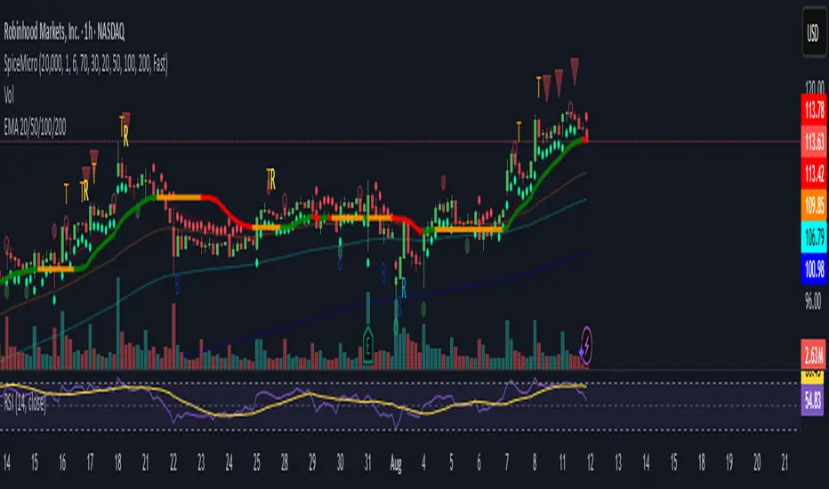
DeltaTrace ForecastDeltaTrace Forecast is a forward-looking projection tool that visualizes the probable directional path of price using a multi-timeframe momentum model rooted in volatility-adjusted nonlinear dynamics. Rather than relying on traditional indicators that react to price after the fact, DeltaTrace estimates future price motion by tracing the progression of momentum changes across expanding timeframes—then scaling those deltas using adaptive volatility to forecast a plausible path forward.
At its core, DeltaTrace constructs a momentum vector from a series of smoothed z-scores derived from increasing multiples of the current chart's timeframe. These z-scores are normalized using a hyperbolic tangent function (tanh), which compresses extreme values and emphasizes meaningful deviations without being overly sensitive to outliers. This nonlinear normalization ensures that explosive moves are weighted with less distortion, while still preserving the shape and direction of the underlying trend.
Once the z-scores are calculated for a range of 12 timeframes (from 1× the current timeframe up to 12×), the indicator computes the first difference between each adjacent pair. These differences—or deltas—represent the change in momentum from one timeframe to the next. In this structure, a strong positive delta implies momentum is strengthening as we look into higher timeframes, while a negative delta reflects waning or reversing strength.
However, not all deltas are treated equally. To make the projection adaptive to market volatility and temporally meaningful, each delta is scaled by the square root of its corresponding timeframe multiple, weighted by the ATR (Average True Range) of the base timeframe. This square-root volatility scaling mirrors the behavior of Brownian motion and reflects the natural geometric diffusion of price over time. By applying this scaling, the model tempers its forecast according to recent volatility while maintaining proportional distance over longer time horizons.
The result is a chain of projected price steps—11 in total—starting from the current closing price. These steps are cumulative, meaning each one builds upon the previous, forming a continuously adjusted polyline that represents the most recent forecast path of price. Each point in the forecast line is directional: if the next projected point is above the last, the segment is colored green (upward momentum); if below, it is colored red (downward momentum). This color coding gives immediate visual feedback on the nature of the projected path and allows for intuitive at-a-glance interpretation.
What makes DeltaTrace unique is its combination of ideas from signal processing, time-series momentum analysis, and volatility theory. Instead of relying on static support/resistance levels or lagging moving averages, it dynamically adapts to both momentum curvature and volatility structure. This allows it to be used not just for trend confirmation, but also for top-down bias fading, reversal anticipation, and path-following strategies.
Traders can use DeltaTrace in a variety of ways depending on their style:
For trend traders, a consistent upward or downward curve in the forecast suggests directional continuation and can be used for position sizing or confirmation of bias.
For mean-reversion traders, exaggerated divergence between the current price and the first few forecast points may indicate temporary exhaustion or overextension.
For scalpers or intraday traders, the short-term bend or flattening of the initial segments can reveal early signs of weakening momentum or build-up before breakout.
For swing traders, the full shape of the polyline gives an evolving map of market rhythm across time compression, allowing for context-aware decision-making.
It’s important to understand that this is a path projection tool, not a precise price target predictor. The forecast does not attempt to predict exact price levels at exact bars, but rather illustrates how the market might evolve if the current multi-timeframe momentum structure persists. Like all models, it should be interpreted probabilistically and used in conjunction with other confirmation signals, risk management tools, or strategy frameworks.
Inputs allow customization of the z-score calculation length and ATR window to tune the sensitivity of the model. The color scheme for up/down forecast segments can also be adjusted for personal preference. Additionally, users can toggle the polyline forecast on or off, which may be useful for pairing this indicator with others in a crowded chart layout.
Because the forecast path is calculated only on the last bar, it does not repaint or shift once the candle closes—preserving historical accuracy for visual inspection and backtesting reference. However, it is also sensitive to changes in volatility and momentum structure, meaning it updates each bar as conditions evolve, making it most effective in real-time decision support.
DeltaTrace Forecast is particularly well-suited for traders who want a deeper understanding of hidden momentum shifts across timeframes without relying on traditional trend-following tools. It reveals the shape of future possibility based on present dynamics, offering a compact yet powerful visualization of directional bias, transition risk, and path strength.
To maximize its utility, consider pairing DeltaTrace with volume profiles, order flow tools, higher timeframe zones, or market structure indicators. Used in context, it becomes a powerful companion to both systematic and discretionary trading styles—especially for those who appreciate a blend of mathematics and intuition in their market analysis.
This indicator is not based on magic or black-box logic; every component—from the z-score standardization to the volatility-adjusted deltas—is fully transparent and grounded in simple, interpretable mechanics. If you're looking for a reliable way to visualize multi-timeframe bias and momentum diffusion, DeltaTrace provides a unique lens through which to interpret future potential in an ever-shifting market landscape.

VP + Game Theory Integrated Strategy9s için DüşünceVP + Game Theory Integrated Strategy Indicator: Explanation and Working Logic
Hello! You can upload the provided Pine Script code to TradingView. This is compatible with Pine Script Editor (v6 version) – simply copy-paste it directly. The indicator's name is "VP + Game Theory Integrated Strategy," and since overlay=true, it will display on top of the price chart (over the candlesticks). Maximum boxes, lines, and labels are set to 500, so it handles dense charts without performance issues.
Below, I'll provide a detailed explanation of the indicator, its working logic, main components, and usage tips step by step. This indicator integrates Volume Profile (VP), Game Theory, and Wick (Candle Wick) Patterns to generate buy/sell signals. It aims to detect high-probability reversal points by analyzing market liquidity, herd behavior, and institutional movements. It's suitable for crypto, forex, or stock markets, but always backtest before using in live trading.
1. General Description
Purpose: This indicator combines volume-based analysis (Volume Profile), game theory elements (herd behavior, Nash equilibrium, contrarian strategies), and candle wick patterns. It identifies strong resistance/support levels (POC, VAH/VAL, liquidity zones) and generates "Power" signals based on them. Signals are shown with labels, lines, and alerts for buy (green) or sell (red).
Key Features:
Volume Profile (VP): Calculates high-volume areas (POC: Point of Control, the highest volume level; VAH/VAL: Value Area High/Low) and displays them on the chart.
Game Theory (GT): Models the market as "players" (retail herd, institutions). Detects herd buying/selling panics and generates contrarian signals.
Wick-Based Signals: Captures reversals with large wicks. Applies strict criteria for "Power" and "Ultra Power" levels.
Market Maker (MM) Elements: Monitors liquidity traps and institutional volume spikes.
Visualization: Nash bands, liquidity boxes, info table (top-right), background colors, and alerts.
Signal Types: Normal, Power, Ultra Power, GT-confirmed. Signals are limited (max 1-5 per zone) with a minimum wait time (40 bars).
Input Parameters: Grouped into 3 sections (GT, Wick, VP, MM). Default values are balanced, but customizable (e.g., strictMode=true makes it more selective).
Warning: This is an indicator, not a full strategy. It includes alerts, but add stop-loss/take-profit for risk management. Use TradingView's Strategy Tester for backtesting.
2. Working Logic (Step by Step)
The indicator processes each bar (candle) as follows:
a. Basic Calculations
ATR (Average True Range): Measures volatility (20 periods). Candle size (high-low) must be at least ATR x 2.5 for signals to be valid.
Candle Components: Calculates candle body (close-open), upper/lower wick.
Volume Analysis: Average volume (SMA 20), detects spikes (based on threshold).
Trend Filter: EMAs (20/50/200) determine up/downtrend. In strict mode, it's stricter (strong uptrend: EMA20 > EMA50 > EMA200 and close > EMA20).
b. Game Theory (GT) Component
Herd Behavior: RSI (14) overbought/oversold (70/30) + volume spike + momentum detects it. Herd buying: Overbuying frenzy (red background). Herd selling: Selling panic (green background).
Institutional Flow: Volume > average x 2.5 + Accumulation/Distribution (AD) indicator. Accumulation: Institutions buying (strengthens buy signals). Distribution: Selling (strengthens sell).
Liquidity Traps: In the last 50 bars, if a new high/low is broken but close pulls back + volume spike = Trap (up/down).
Smart Money: Intra-candle movement (close-open)/(high-low) x volume. Positive = Smart money inflow.
Nash Equilibrium: Price mean (SMA 100) ± deviation (stdev x 0.02). In equilibrium: Normal. Above: Sell potential. Below: Buy. Bands are optionally shown.
GT Signals:
Contrarian: Herd selling + accumulation = Buy.
Momentum: Below Nash + positive smart money = Buy (opposite for sell).
Nash Reversion: Below Nash + rising close + volume = Buy.
Power Signal: At least 3 GT signals (min_signals_for_power=3) + volume confirmation = Power GT buy/sell. Can show only GT-confirmed signals (show_gt_only_signals=true).
c. Volume Profile (VP) Component
Calculation: For the last 100 bars (vpPeriod), divides the price range (high-low) into vpRows (24) rows. Distributes volume across rows.
POC (Point of Control): Highest volume level (orange line). Threshold 80% (pocThreshold).
Value Area (VA): 70% of total volume (valueAreaPercent). VAH (upper bound, blue dotted), VAL (lower bound).
High-Volume Area: Price near POC or volume > POC x 80% = Strong zone.
Visualization: Histogram boxes on the right (blue/orange). POC/VAH/VAL lines and labels.
d. Wick (Candle Wick) and Power Signals
Main Wick Criteria: Large candle (ATR x 2.5), small body (<8%), wick 8x body length (anaFitilCarpan) and 80% of candle (anaFitilYuzde). High volume + trend filter (downtrend for upper wick).
Signal Wick: More flexible for triggers (5x length, 70%).
Power/Ultra Power:
Power Sell: Main upper wick + near POC/VAH + MM volume (2.5x) + GT contrarian/momentum.
Power Buy: Similar for lower wick.
Super Wick: Power + institutional volume + strong momentum.
Ultra Power: Super + GT power (3/3) + distribution/accumulation + Nash deviation + liquidity trap. Rarest and strongest (fuchsia/lime color).
Signal Management: Detected wick level (high/low) is saved. Wait min 40 bars, max 1-5 signals per zone. When trigger candle arrives (price reaches level + long wick + close in opposite direction) = BUY/SELL plotshape.
e. Market Maker (MM) and Liquidity
MM Volume: Average x 2.5 + wick bonus (1.3x).
Liquidity Zones: Saves last 20 high-volume highs/lows. Shown as boxes on chart (red/green, lasting 200 bars).
Traps: Integrated with GT, strengthens power signals.
f. Visualization and Alerts
Background: Ultra Power (fuchsia/lime), Power GT (red/green), Herd (red/green).
Lines: Active resistance/support (dashed, colored).
Table (Top-Right): Resistance/support levels, remaining signals, POC/VAH/VAL, GT status (herd, institutional, Nash, signal strength), volume/liquidity.
Alerts: For Ultra Power, GT Power, Super Wick, normal signals. Messages include level/price.
g. Filters and Options
Strict Mode: Stricter (higher volume 1.5x, strong trend, RSI filter).
Require Volume Confirmation: Mandatory volume check.
Only Show Power Signals: Display only power/ultra.
Require Ultra Power: Strictest, only ultra.
3. Usage Tips
Chart Timeframe: H1-D1 for medium-long term. Shorter frames (M1-M5) may produce too many signals.
Settings:
StrictMode=true: Fewer but higher-quality signals.
Use_game_theory=false: Use only VP + Wicks.
ShowVP=false: Hide histogram to reduce clutter.
Strategy Integration: Filter BUY/SELL with EMAs. Stop-loss: ATR x 1-2, Take-profit: POC/VAH levels.
Backtesting: Convert to strategy in TradingView (use alertconditions). Test on historical data.
Risk: Designed for market manipulation (MM traps), but no indicator is 100% accurate. Apply capital management.
Troubleshooting: If errors (e.g., vpInitialized=false), increase period or refresh chart.
This indicator is complex but powerful – blending VP for volume zones with GT for psychology. If you have questions or need setting changes, let me know!

Markov Chain Trend ProbabilityA Markov Chain is a mathematical model that predicts future states based on the current state, assuming that the future depends only on the present (not the past). Originally developed by Russian mathematician Andrey Markov, this concept is widely used in:
Finance: Risk modeling, portfolio optimization, credit scoring, algorithmic trading
Weather Forecasting: Predicting sunny/rainy days, temperature patterns, storm tracking
Here's an example of a Markov chain: If the weather is sunny, the probability that will be sunny 30 min later is say 90%. However, if the state changes, i.e. it starts raining, how the probability that will be raining 30 min later is say 70% and only 30% sunny.
Similar concept can be applied to markets price action and trends.
Mathematical Foundation
The core principle follows the Markov Property: P(X_{t+1}|X_t, X_{t-1}, ..., X_0) = P(X_{t+1}|X_t)
Transition Matrix :
-------------Next State
Current----
--------P11 P12
-----P21 P22
Probability Calculations:
P(Up→Up) = Count(Up→Up) / Count(Up states)
P(Down→Down) = Count(Down→Down) / Count(Down states)
Steady-state probability: π = πP (where π is the stationary distribution)
State Definition:
State = UPTREND if (Price_t - Price_{t-n})/ATR > threshold
State = DOWNTREND if (Price_t - Price_{t-n})/ATR < -threshold
How It Works in Trading
This indicator applies Markov Chain theory to market trends by:
Defining States: Classifies market conditions as UPTREND or DOWNTREND based on price movement relative to ATR (Average True Range)
Learning Transitions: Analyzes historical data to calculate probabilities of moving from one state to another
Predicting Probabilities: Estimates the likelihood of future trend continuation or reversal
How to Use
Parameters:
Lookback Period: Number of bars to analyze for trend detection (default: 14)
ATR Threshold: Sensitivity multiplier for state changes (default: 0.5)
Historical Periods: Sample size for probability calculations (default: 33)
Trading Applications:
Trend confirmation for entry/exit decisions
Risk assessment through probability analysis
Market regime identification
Early warning system for potential trend reversals
The indicator works on any timeframe and asset class. Enjoy!

mmxm overlay# MMXM Overlay - Market Maker Model Trading Tool
## Overview
The MMXM Overlay is designed to help traders identify key market maker accumulation and distribution zones using algorithmic detection methods. This indicator provides visual context for understanding institutional trading behavior and potential reversal areas.
## Key Features
### Smart Market Structure Detection
- **Accumulation Zones**: Highlighted areas where institutional buyers may be building positions
- **Distribution Zones**: Marked regions where institutional sellers may be offloading positions
- **Up/Down Signals**: Precise entry/exit points for both bullish and bearish market conditions
### Customizable Visual Elements
- **Color-coded boxes** for easy identification of accumulation vs distribution phases
- **Adjustable Up/Down signal colors** to match your charting preferences
- **Clean, minimalist design** that doesn't clutter your chart analysis
## Trading Applications
### Position Entry Strategies
- Use accumulation zones to identify potential long entry opportunities
- Utilize distribution zones to spot potential short entry setups
- **Up signals** (green triangles) indicate bullish momentum shifts
- **Down signals** (red triangles) indicate bearish momentum shifts
### Risk Management
- Box boundaries can serve as natural stop-loss levels
- Zone transitions help identify when market character is changing
- Clear visual feedback for position sizing decisions
- Up/Down signals provide precise timing for trade execution
### Market Context Analysis
- Understand when institutions are actively positioning
- Identify periods of consolidation vs directional movement
- Recognize potential reversal areas before they occur
- Simple Up/Down visual cues for quick decision making
## Best Practices
- Combine with your existing technical analysis for confirmation
- Use multiple timeframes to validate signals
- Consider overall market conditions and fundamentals
- Practice proper risk management with all trading decisions
- Wait for confirmation after Up/Down signals before entering trades
## Settings Customization
- **Accumulation Box**: Customize background and border colors for bullish zones
- **Distribution Box**: Adjust visual appearance for bearish zones
- **Up Signal Color**: Choose color for bullish momentum signals
- **Down Signal Color**: Select color for bearish momentum signals
## Signal Interpretation
- **Up Signals**: Appear below price bars, suggesting potential upward movement
- **Down Signals**: Appear above price bars, suggesting potential downward movement
- **Accumulation Boxes**: Green-tinted areas indicating institutional buying interest
- **Distribution Boxes**: Red-tinted areas indicating institutional selling pressure
## Important Notes
This indicator is designed for educational purposes and should not be considered as financial advice. Always conduct your own analysis and use proper risk management when trading. Past performance does not guarantee future results.
The MMXM Overlay works on all timeframes and markets, making it versatile for various trading styles from scalping to swing trading. The simplified Up/Down signal system makes it accessible for traders of all experience levels.

ATR Trailing + Alerts + Price LabelsATR Trend is a clean and intelligent trend-following overlay built for traders who want clarity during both trending and ranging markets.
This indicator dynamically detects bullish and bearish market trends using the Average True Range (ATR), applying a confirmation-based approach to filter out false signals and minor pullbacks.
The trend line is:
Blue 🔵 during uptrends.
Black ⚫ during downtrends.
Continuous, recalculating only when the market truly shifts — not just when price temporarily crosses the line.
When a confirmed trend reversal occurs:
A 🔼 or 🔽 label shows the exact price of the flip.
An alert can be triggered to notify the user immediately.
💡 Features:
✅ Single-line trend direction
✅ Filters out short-term noise
✅ Exact price labeling on trend change
✅ Built-in alerts for up/down trend shifts
⚙️ Inputs:
ATR Period – Length of ATR calculation (default: 14)
ATR Multiplier – Offset for trend line placement (default: 2.0)
Flip Sensitivity – Number of bars required to confirm a trend reversal (default: 3)
This tool is suitable for:
Swing traders avoid false breakouts
Scalpers looking for high-probability trend entries
Algorithmic setups requiring structured trend logic
WVAD with Gap Compensation**Indicator Name:** WVAD with Gap Compensation
**Purpose:** Enhances the classic Williams Vix Fix (WVAD) by incorporating the impact of price gaps (jump ups/downs) in its calculation.
**Key Features:**
1. **Gap Detection:** Automatically identifies significant gaps (default: >0.5% from prior bar's high/low).
2. **Gap Compensation:** Adjusts the WVAD calculation by adding the gap size to the daily price change.
3. **Dynamic Weighting:** Applies a multiplier (1.2x or 1.5x) to the WVAD value on days with medium/large gaps (based on ATR).
4. **Visualization:**
- Plots the enhanced WVAD line (blue) and optionally the original WVAD (gray circles).
- Marks gap events with colored arrows (green ▲ for gap up, red ▼ for gap down) and connects the gap's impact with dashed lines.
- Includes a zero line for reference.
**Use Cases:**
- Gauges the true strength of money flow by accounting for gaps.
- Identifies potential trend shifts around gap events.
- Filters noise by focusing on significant gaps.
**Parameters:**
- `Accumulation Period`: Number of days to sum WVAD (default: 12).
- `Gap Threshold (%)`: Minimum gap size to trigger compensation (default: 0.5%).
- `Show Original WVAD`: Toggles display of the classic WVAD.
**Version:** Pine Script® v6

52SIGNAL RECIPE Directional Consistency Index═══ 52SIGNAL RECIPE Directional Consistency Index (DCI) ═══
◆ Overview
52SIGNAL Directional Consistency Index (DCI) is a technical indicator that measures the directional consistency of market movements. This indicator focuses on the consistency of direction rather than the magnitude of price changes, analyzing the strength of market trends and providing more reliable trend analysis by filtering out noise to reflect only meaningful price movements.
─────────────────────────────────────
◆ Key Features
• Direction-Focused Analysis: Concentrates solely on directional consistency rather than magnitude of price changes
• Noise Filtering: Ignores insignificant price movements through minimum percentage change settings
• Trend Exhaustion Detection: Identifies potential trend reversals as values approach ±0.5 levels
• Intuitive Visualization: Instant recognition of trend direction through color changes based on rising/falling zones
• Multi-Market Application: Adaptable to various financial markets including stocks, cryptocurrencies, and forex
─────────────────────────────────────
◆ Technical Foundation
■ Directional Calculation
• Basic Principle: Counts only the up/down movement of each candle to measure directional consistency
• Calculation Method: Determines direction based on percentage change between current close and previous close
• Direction Values: Simplified into Rising (+1), Falling (-1), or Insignificant Change (0)
• Averaging: DCI calculated as the moving average of direction values over the specified period
■ Noise Filtering Mechanism
• Minimum Percentage Change: The minimum percent change required to consider a price movement significant
• Filtering Effect: Movements smaller than the minimum change are excluded from direction calculation (treated as 0)
• Enhanced Reliability: Adjustable filtering strength for optimization across different market environments
─────────────────────────────────────
◆ Practical Applications
■ Trend Identification & Reversal Prediction
• Early Uptrend Detection:
▶ When DCI enters the 0 to +0.3 range
▶ When recent directional consistency begins to consistently rise
• Early Downtrend Detection:
▶ When DCI enters the 0 to -0.3 range
▶ When recent directional consistency begins to consistently fall
• Trend Reversal Signals:
▶ When DCI approaches +0.5 (uptrend exhaustion, potential downward reversal)
▶ When DCI approaches -0.5 (downtrend exhaustion, potential upward reversal)
■ Trading Strategy Implementation
• Trend Following Strategies:
▶ Consider buying when DCI crosses above the 0 line
▶ Consider selling when DCI crosses below the 0 line
• Reversal Trading:
▶ Consider taking profits or short positions when DCI approaches +0.5
▶ Consider long positions when DCI approaches -0.5
• Divergence Confirmation:
▶ Weakening uptrend signal when price rises but DCI weakens
▶ Weakening downtrend signal when price falls but DCI strengthens
─────────────────────────────────────
◆ Advanced Setting Options
■ Period (Length) Settings
• Short-term Analysis: 5-10 days (faster signals, more sensitive responses)
• Medium-term Analysis: 10-20 days (balanced signals, recommended default)
• Long-term Analysis: 20-30 days (slower signals, long-term trend identification)
■ Minimum Percentage Change Settings
• Low Volatility Markets: 0.05-0.2% (suitable for forex markets)
• Medium Volatility Markets: 0.3-0.5% (suitable for stock markets)
• High Volatility Markets: 0.5-1.0% (suitable for cryptocurrency markets)
■ Settings by Trading Style
• Scalping: Lower period (5-10), lower minimum change (0.05-0.1%)
• Day Trading: Medium period (10-15), medium minimum change (0.2-0.3%)
• Swing Trading: Higher period (15-25), higher minimum change (0.3-0.5%)
─────────────────────────────────────
◆ Synergy with Other Indicators
• Moving Averages: Strengthen signals by confirming moving average crossovers when DCI crosses the 0 line
• RSI: Combine DCI trend direction with RSI overbought/oversold levels to confirm entry points
• MACD: Enhance reliability by pairing DCI directional signals with MACD momentum confirmation
• Bollinger Bands: Analyze volatility by checking Bollinger Band expansion/contraction when DCI approaches ±0.5
─────────────────────────────────────
◆ Conclusion
52SIGNAL Directional Consistency Index (DCI) is a powerful tool for objectively measuring market directionality and visualizing trend strength. The noise filtering through minimum percentage change settings can be adjusted to match your trading style and market characteristics for optimal results. Its ability to identify early trend stages and detect overextended zones provides traders with important entry and exit points. When used in conjunction with other technical indicators, it can significantly enhance the reliability of trading decisions.
─────────────────────────────────────
※ Disclaimer: Past performance does not guarantee future results. Always use appropriate risk management strategies.
═══ 52SIGNAL 방향성 일관성 지수 (DCI) ═══
◆ 개요
52SIGNAL 방향성 일관성 지수(DCI)는 시장의 방향성 일관성을 측정하는 기술적 지표입니다. 이 지표는 가격 변화의 크기가 아닌 방향의 일관성에 중점을 두어 시장의 추세 강도를 분석하고, 노이즈 필터링 기능을 통해 의미 있는 가격 변동만을 반영하여 더 신뢰할 수 있는 추세 분석을 제공합니다.
─────────────────────────────────────
◆ 주요 특징
• 방향성 중심 분석: 가격 변화의 크기가 아닌 방향성에만 집중하여 추세의 일관성 측정
• 노이즈 필터링: 최소 변화율 설정을 통해 의미 없는 작은 가격 변동을 무시
• 추세 과열 감지: ±0.5 수준에 접근할 때 추세 전환 가능성 식별
• 직관적인 시각화: 상승/하락 구간에 따른 색상 변화로 추세 방향 즉각 인식
• 다양한 시장 적용: 주식, 암호화폐, 외환 등 다양한 금융 시장에 적용 가능
─────────────────────────────────────
◆ 기술적 기반
■ 방향성 계산
• 기본 원리: 각 캔들의 상승/하락 여부만 카운트하여 방향의 일관성 측정
• 계산 방법: 현재 종가와 이전 종가의 퍼센트 변화를 기준으로 방향 판단
• 방향 값: 상승(+1), 하락(-1), 의미 없는 변화(0)로 단순화
• 평균화: 설정된 기간 동안의 방향 값의 이동평균으로 DCI 산출
■ 노이즈 필터링 메커니즘
• 최소 변화율: 의미 있는 가격 변동으로 인정할 최소 퍼센트 변화
• 필터링 효과: 최소 변화율보다 작은 변동은 방향 계산에서 제외(0으로 처리)
• 신뢰도 향상: 필터링 강도 조절을 통해 다양한 시장 환경에 최적화 가능
─────────────────────────────────────
◆ 실용적 응용
■ 추세 식별 및 전환점 예측
• 상승 추세 초입:
▶ DCI가 0에서 +0.3 사이로 진입할 때
▶ 최근 방향성이 일관되게 상승하기 시작할 때
• 하락 추세 초입:
▶ DCI가 0에서 -0.3 사이로 진입할 때
▶ 최근 방향성이 일관되게 하락하기 시작할 때
• 추세 전환 신호:
▶ DCI가 +0.5에 가까워질 때 (상승 추세 과열, 하락 전환 가능성)
▶ DCI가 -0.5에 가까워질 때 (하락 추세 과열, 상승 전환 가능성)
■ 트레이딩 전략 적용
• 추세 추종 전략:
▶ DCI가 0선을 위로 돌파할 때 매수 고려
▶ DCI가 0선을 아래로 돌파할 때 매도 고려
• 반전 트레이딩:
▶ DCI가 +0.5에 근접할 때 이익실현 또는 매도 포지션 고려
▶ DCI가 -0.5에 근접할 때 매수 포지션 고려
• 다이버전스 확인:
▶ 가격은 상승하나 DCI가 약화될 때 상승 추세 약화 신호
▶ 가격은 하락하나 DCI가 강화될 때 하락 추세 약화 신호
─────────────────────────────────────
◆ 고급 설정 옵션
■ 기간(Length) 설정
• 단기 분석: 5-10일 (빠른 신호, 민감한 반응)
• 중기 분석: 10-20일 (균형 잡힌 신호, 기본 권장)
• 장기 분석: 20-30일 (느린 신호, 장기 추세 식별)
■ 최소 변화율(Minimum % Change) 설정
• 저변동성 시장: 0.05-0.2% (외환 시장에 적합)
• 중변동성 시장: 0.3-0.5% (주식 시장에 적합)
• 고변동성 시장: 0.5-1.0% (암호화폐 시장에 적합)
■ 트레이딩 스타일별 설정
• 스캘핑: 낮은 기간(5-10), 낮은 최소 변화율(0.05-0.1%)
• 데이 트레이딩: 중간 기간(10-15), 중간 최소 변화율(0.2-0.3%)
• 스윙 트레이딩: 높은 기간(15-25), 높은 최소 변화율(0.3-0.5%)
─────────────────────────────────────
◆ 다른 지표와의 시너지
• 이동평균선: DCI가 0선을 돌파할 때 이동평균 교차 확인으로 신호 강화
• RSI: DCI의 추세 방향과 RSI의 과매수/과매도 수준을 결합하여 진입점 확인
• MACD: DCI의 방향성 신호와 MACD의 모멘텀 확인을 결합하여 신뢰도 향상
• 볼린저 밴드: DCI가 ±0.5에 근접할 때 볼린저 밴드 확장/수축 확인으로 변동성 분석
─────────────────────────────────────
◆ 결론
52SIGNAL 방향성 일관성 지수(DCI)는 시장의 방향성을 객관적으로 측정하고 추세의 강도를 시각화하는 강력한 도구입니다. 최소 변화율 설정을 통한 노이즈 필터링은 각자의 트레이딩 성향과 시장 특성에 맞게 조정할 수 있어 최적의 효과를 누릴 수 있습니다. 추세의 초기 단계를 식별하고 과열 구간을 감지하는 능력은 트레이더에게 중요한 진입 및 퇴출 포인트를 제공합니다. 다른 기술적 지표와 함께 사용하면 트레이딩 결정의 신뢰도를 크게 향상시킬 수 있습니다.
─────────────────────────────────────
※ 면책 조항: 과거 성과가 미래 결과를 보장하지 않습니다. 항상 적절한 리스크 관리 전략을 사용하세요.
BTC Transaction Indicator Name: "Bitcoin On-Chain Volume & Dynamic Parabolic Curve Signals"
Purpose:
This indicator is designed for Bitcoin traders and long-term holders. It combines the analysis of Bitcoin's on-chain transaction volume with price action to generate "Whale" and "Bear" signals. Additionally, it features a unique dynamic parabolic curve that acts as a visual support line, adapting its visibility based on price interaction with a key Exponential Moving Average (EMA).
Key Components:
On-Chain Volume Analysis:
Utilizes Estimated Transaction Volume (ETRAV) data from the Bitcoin blockchain.
Calculates fast and slow Simple Moving Averages (SMAs) of this volume.
Identifies volume trends (up/down) and significant volume increases/decreases.
Employs fixed thresholds (2,500,000 for low volume and 25,000,000 for high volume) to define key activity levels, similar to how historical on-chain analysis defined accumulation and distribution zones.
Price Action Analysis:
Calculates fast and slow SMAs of the price.
Detects price trends (up/down), recoveries, and declines based on these price SMAs.
"Whale" and "Bear" Signals:
Whale Signals (Buy-side): Generated when there's an upward volume trend, significant volume increase, and a downward price trend followed by price recovery. These indicate potential accumulation phases.
Bear Signals (Sell-side): Generated when there's a downward volume trend, significant volume decrease, and an upward price trend followed by price decline. These indicate potential distribution phases.
Visuals: Both types of signals are plotted as small, colored circles directly on the price chart, with corresponding text labels ("Whale," "Buy," "Bear," "Sell," "Price Recovering," "Price Declining").
Dynamic Parabolic Curve:
Concept: A green parabolic (exponential) curve that serves as a dynamic visual support line.
Activation: The curve starts drawing automatically only when the price crosses over the EMA 500 (Exponential Moving Average of 500 periods). The curve's starting point is set at a user-defined percentage below the EMA 500 value at that exact crossover point.
Visibility: The curve remains visible and continues its trajectory only as long as the price stays above the EMA 500.
Deactivation: The curve disappears instantly if the price falls below or equals the EMA 500. It will only reappear if the price crosses above the EMA 500 again.
Customization: The curve's steepness (Tasa Crecimiento Curva) and its initial distance from the EMA 500 (Inicio Curva % por debajo de EMA500) are adjustable.
Dynamic Label: A "Parabólico" text label is plotted near the center of the active curve segment, with an adjustable vertical offset to ensure it stays visually appealing below the curve.
What is PLOTTED on the chart:
The small, colored circle signals for Whale/Buy and Bear/Sell activity.
The green dynamic parabolic curve.
What is NOT PLOTTED:
EMA 200, EMA 500 lines (though they are calculated internally for logic).
Raw volume data or volume Moving Averages (these are only used for signal calculation, not plotted).
Ideal for:
Bitcoin traders and investors focused on long-term trends and cycle analysis, who want visual cues for accumulation/distribution phases based on on-chain activity, complemented by a unique, dynamically appearing parabolic support curve.
Important Notes:
Relies on the availability of external on-chain data (QUANDL:BCHAIN) within TradingView.
Functions best on a daily timeframe for optimal on-chain data relevance.